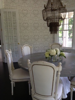
Y'all, TRUST that this GORG dining room didn't just wake up like this...
Read MoreGuess Who's Coming to Dinner?
How-To
Y'all, TRUST that this GORG dining room didn't just wake up like this...
Read More For those of y'all who are able, please join me this coming Sat 12/8 at Art in Flux Harlem, where along with several other interior experts, I'll be dishing on how to decorate your home for the holidays and how to incorporate art into the home setting! Slain! It's also a wine tasting with some nosh and an exhibit! Woohoo! Art-realness!
The event is part of "Art Enology." Twenty Artists on Wine exhibit to highlight Harlem's growing art scene. Exhibit runs from Dec 2012 to Jan 2013. Here's a more official, proper blurb b/c y'all know my jank description above is so not pitch perfect:
'Tis the Season…for Art & Wine: Sat. Dec. 8th 1-3pm. During the holiday season there is lots of celebrating and decorating to do. In this event, participants will receive tips from experts in art, wine and interior design on how to incorporate art and wine into the holiday season. Questions that will be answered include: how to select art/wine as a holiday gift; how to select the right wine for a Christmas/New Year’s party; and how art and wine can be used to decorate the home during the holiday season and all year-round. The event will also include tastings and an artist meet-and-greet. Fun! Right y'all?? But wait...there's MORE:
Art.com will be showin' some love by offering some prizes during the event...'cause that's how it is when you're an 'Inspired Insider' with art.com...did i mention art.com? The events’ sponsors include Simone International/Papi Wines, Ebony.com and Cuisine Noir magazine, with production by Souleo Enterprises, LLC, an event/media production company.
This is all going down at Art in Flux Harlem, 1961 Adam Clayton Powell Jr. Blvd (7th Ave.) at 118th Street, in New York, New York. 646-340-3479, info@artinfluxharlem.com and click here for even more info. Hope to see y'all!!!
One of my many 'job duties' as a prop & set stylist for photo shoots is to compose items/objects being photographed, like this:

That's an early version of a cosmetics shot that I composed for the Taigan.com 2012 holiday gift guide...it's not brain surgery here, folks, but it's a close second at least, I mean, c'mon...the beauty industry? The economy? Y'all do the math! Anyway, I digress...here's where we ended up:
A little composition love goes a LONG way, right? What started out as cute & contained grew to be fun & flirty with lots of energy and movement. Now, don't y'all just want to buy all that shiot right now? I mean, look how gorg it is, spread all across the place just beckoning, ever so tenderly...Cosmetic Confessions!
Shout out to the uber-talented photographer dynamo, Emily J Anderson, and Ellie Sommerville McNevin, who art directed beyond belief! Trebbie! We had a great time together and I think we served up one sassy gift guide...check it here. So now, none of y'all have ANY excuses for last-minute holiday shopping scrambles, OK?!
 Y'all, I'm thrilled to share that I was asked to participate in a painting party for MyColor inspired by Pantone paint!!! Holla! What in hell does THAT mean, y'all ask??? Well, along with four other awesome diy bloggers, who will be blogging at the same time with cool projects of their own, I'll be completing a special diy project using MyColor inspired by Pantone paint.
In addition to learning all the 411 on my project, y'all will be able to scoot over to the next diy blogger's post in a pre-determined order and get more ideas and inspiration from their projects. The BEST part? Y'all can comment on my post for a chance to win a sample of MyColor inspired by Pantone paint!!! What-What?! FREE PAINT, y'all!!! Get IT! VALUE! Here are the other diy dynamos and the order of the party (they'll be links and more detailed instructions in tomorrow's post, this is a friendly heads-up):
Courtney @ A Thoughtful Place PJ @ Blog-A-Dazzle Cassie @ Primitive and Proper Holly @ Life in the Fun Lane Angela @ Number Fifty-Three Heather @ Paper Princess Studio
Remember, the par-tay starts at 12p EST sharp. So, this means, regardless of where you live, y'all need to do some math and figure out what time 12p EST is for you and then hit up Blog-A-Dazzle to fulfill your painting destinies, ok?!!
Y'all the headboard & footboard I scored while whoring a few weeks back is starting to take on a new sassy, albeit,stainless steel persona:
Blam! And look at this shiot:
But WAIT, there's more!:
The paint stripper is like liquid acid! Genius! I'm sure I'm forever changed, metaphysically, from breathing in the fumes at this point, and, of course, I'm not wearing gloves--- don't do this at home Dazzlers--- but the process overall has been smooth sailing, and I've been taken to new highs I never knew I could reach!!! Styleslapping to come soon!
For some HOT Before and After action up in this 'dazzle, what...THRIFT WHORE THURSDAY!?!This thrift store armoire was scored for a client while out whoring weeks ago:
Don't be shy babydoll, we need to see the goods:
Here's where we are today:
And:
YES, y'all! This armoire has been totally tricked out: new paint job, drawers lined in pink felt, custom mirror added to the inside back topped off with some interior lighting chic-ness!
The client is just thrilled beyond belief with how this turned out and so am I...just goes to show y'all what some good honest thrift whoring can do for your lives...happy whoring!
Y'all, I've started to strip the nasty finish off my new bed frame that I scored last week while out Thrift Whoring...check it:
I'm using a liquid paint & finish remover called, Zip Strip, which is probably highly toxic beyond belief, but damn it sure does eat that brown finish right off...look:
I'm brushing the liquid on with a craft brush, letting it set a bit, then wiping off with an old rag. I've had to repeat this process a couple times in certain spots, but it's really easy:
Y'all can see the stainless steel showing through! There's some blemishes here and there in the steel, but y'all know we're all a little imperfect and I think it adds even more character! Imagine how chic this is going to look when totally finished? And remember, this frame cost me $20!!! After its all been stripped, I will seal it with butcher's wax or a matte polyurethane to prevent rusting...stay tuned, y'all!!!
Y'all here's a quick update on the armoire makeover:
Refresher: I'm repurposing this thrift store armoire into a bar & additional dining room storage for one of my clients. It's a beast of a thing, and has been soaking up paint like a sponge, but we're getting there...
I just can't gush enough about this idea-- I'm forever seeing these old wardrobes/dressers, entertainment centers, or even china cabinets, at the thrift stores, for next to nothing-- our dude being tricked out here was a mere $69!!! How appropriate! Scandal!!! With some elbow grease and creativity, y'all can totally customize them to suit the task at hand...my client wanted to be able to shut away the bar & be able to store entertaining extras so if the need arises, they'd all be close at hand...these drawers ought to help her with that, especially when they're lined in this amazing hot pink felt:
I simply used spray mount on drawer bottom and carefully smoothed out the felt towards drawer edges. Next, i slowly trimmed along grooves with exacto knife and scissors, tucking any frayed edges into drawer seams...felt realness:
One down, three more to go!!! I've also got some plans to make the bar nice and glam...Check back for HOT after shots soon!!!
 So y'all know what that means? Time to get your drank on!!! And it just so happens that I'll be enjoying mine from my new bar cart! Oh shiot, lookee here...warning...HOT AFTER ACTION:
This is probably one of the easiest diy's I've ever done! And I just j'adore how it turned out...It's amazing to me how you can completely transform something from it's intended purpose into something else entirely-- with the easy addition of some custom cut glass.
Here's how I made this all happen...
*Create a template for the area that you wish to put glass atop/on. If you're blessed to have a cart with a square or rectangular situation, then this project is even EASIER and you're a biotch! BUT, if, like me, you have an irregular shape that you're working with-- pear, rotund, obtuse c'ankle-- what have you...then y'all have to make a template for glass cutter to work off. I made mine out of craft paper.
*Next cut a rough approximate shape from paper. Holding that shape firmly in place, trace the underside/bottom edges of the basket where your glass will eventually sit inside of. Make sense? This allows ya'll to get the exact shape of the area you want glass cut for.
*Lastly, trim off about 1.5" more from the tracing line you just made in the paper edge with scissors to allow for some clearance of the glass, so it won't scrape against the metal of the cart, once cut. Now you've made your template, which should look something like this:
And there y'all have it! Remember to always measure twice (or even three times) and cut once. Also, as a back-up back-up, if you're just nervous as all hell to trust your template-making skills, you can always bring your cart to your glass cutter. Y'all want at least 1/4" thick glass with a safety edge. My two pieces ran me about $60/each...so, not dirt cheap, but not cra cra either. And this little lady may not always be just a bar cart in my space-- she can now become a side table or console of sorts, etc...so the minimal investment has yielded double and potentially even TRIPLE value, y'all...and that's not something we take lightly here at Blog-A-Dazzle!!! Triple Value!
A lot of times when I tell people about my work as a prop stylist, they go all 'deer in headlights' and usually say something like, 'what's that?', 'huh?', 'you do hair?' Here's what a prop stylist does:
What in hell is that, y'all ask? It's a chianti bottle and it's having candle wax dripped on it for a photograph that will eventually make it's way on a page in a major magazine...they'll be some clever service point to you telling y'all how to take your chianti bottle & reuse it as a candleholder when y'all set that effortless dinner table for your festive holiday party!
Oh, wait...y'all didn't think that those gorgeous shots of rooms/homes/people/parties just happened to be that way, naturally and a photographer just snapped a pic of it? Not always, but you're seeing smoke & mirrors, my friends...or in my case, from my shoot yesterday...bottles and candlewax...
This lovely moment was actually executed by the uber-talented, Andrea Greco, aka Candy, who's a crafting fiend!
So next time y'all are thumbing through the pages of your favorite magazine, wondering if people really live/eat/entertain like that, all the time? The answer might just be no...a prop stylist made it look that way!!!
Y'all, I've had this amazing vintage shopping cart for almost a year:
Such an amazing score!
And honestly, she's just so chic, AS IS, sitting all side table-like in the corner of my salon-- uh huh, I typed salon-- but that's just way too easy for the likes of me. This gal is becoming our new bar cart! Oh shiot, y'all were just style-slapped!!!
 I'm going to have glass custom cut for the bottoms of each of the basket levels, so they become usable/level surfaces from which to get my drink on. Bottoms? Basket? This post sure is gettin' good, y'all-- damn! And I'm not even done yet!
 Once I add my bar (bottles, ice bucket, maybe some glassware, cocktail napkins, etc) and viola...it's happy hour!!! This is probably one of the easiest repurposing projects I'll ever do...so, naturally it's taken almost a year to get done, but whatev's...it's going to be amazing, so stay tuned to get some hot AFTER reveal action, y'all!
Ok, soI know it's like 12:30 AM, and, yes, I've enjoyed some tequila..,but I've still got my wits about me to share the progress of the armoire makeover with y'all...I mean, look at this shiot:
We tested two different colors, both grey, but clearly this is the one carrying the golden torch:
 Damn! This grey man is HOT, right?!? Look at more hotness:
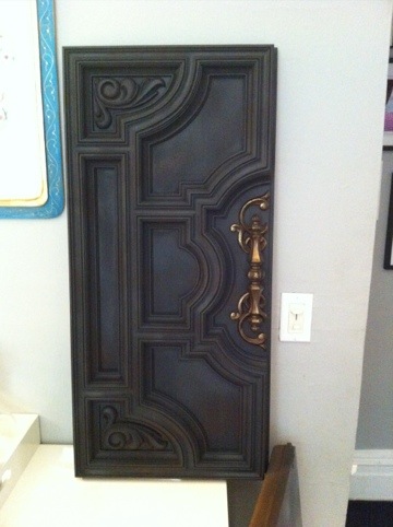 And look how chic this paint treatment gets when I add the hardware:
Earlier this week I'd posted about repetition of pattern and how I was going to apply this technique in my own bathroom, gettin' all kinds of D.I.Y.-dirty on y'all...here's the pattern I'm working from:
Here's what bathroom looked like:

Obvi, I decided to play with scale here, so my bird cages are a lot LARGER. I also deliberately left the birds out for fear of it going way too juvenile and I think this really works. Plus, this makes it much more conceptual, overall, since me and Dyl are now the 'birds' in these larger than life cages...and who doesn't like to get some cage play once in a while?! Chirp! Chirp!
I'm doing all this painting by hand and though exhausting, it's also fun b/c the pattern has a real line drawn/illustrated quality about it, so I can't really make any mistakes...well, I can and have, but they're easily corrected. Basically, it doesn't have to look perfect...it's interpretive of the original and it's super-quirky! My plan is to paint the other three walls in the same way, so check back for more progress updates and more detailed how-to action!
Y'all, here's a HOT tip...repetition makes for one stylish space, if done in the right way. No, this isn't some ancient technique passed down by the decorators of yesteryear...it's really current and makes a huge impact in a space...what is it? This:
By taking a pattern, whether it be a wallpaper or fabric and repeating it on multiple surfaces in one space, you get repetition (this also applies to well-edited collections/collectibles, btw). Sometimes you also get a massive migraine too but there's pills for that...ingest, y'all! This treatment can be a chic way to really amp up the glamour and drama in a space, particularly one that's smaller or has peculiar architecture, like an dormer room. I know it seems counterproductive to completely envelope a tee-niny room in a cra cra pattern, but when executed well, the endless repetition, tends to erase the physical structure & boundaries of the room, so you're left with a seemingly vast expanse of space. Are y'all keeping up?
I use repetition a lot in my work, but have never gone full-on immersion like the above genius example...until now. Our bathroom is a cute spot and will make the perfect place to have a pattern blow out! YES! Here's what it looks like:
 I have this amazing shower curtain that I scored from Urban Outfitters, that sadly enough, is no longer available on their website:
 So since I can't buy more shower curtains to use as fabric for the wall treatment (which depending upon the specific application, isn't a practical thing in a bathroom anyway)...I'll be painting this pattern, by hand! Uh huh, I'm an absolute d.i.y. dork that way and I enjoy self-torture! But, since it's so organic and hand drawn-looking as it is-- I feel confident that I can re-create it, even if it's not perfect. I'm also going to play with scale of the pattern, just to give it more dimension when it's on the walls...and since I have existing tile work partly covering every wall, I don't have to paint as much...holla! If y'all were to tackle a similar project, remember you don't have to go to such extreme lengths by hand painting a pattern b/c there's a ton of fabrics that are also available as wallpapers or some fabrics can be used with spray starch and made into wallpapers as well...check out my former co-worker and friend, Kristin Appenbrink's post about it on Real Simple's Simply Stated blog, here. And check back soon for progress posts on this project! You're forewarned-- It may take a minute, y'all!
Y'all, it's time to get some full-on eye candy! The office is complete, woohoo, BUT before any hot reveal action can occur, have to let y'all know about a slight curve ball with the design plan/furniture solution. I'd found those awesome Ikea desk/combo units (see previous post for pic) which my client was totally on board with. But then she wasn't liking the fact that when configured in the space, they would partially block the inspiration boards that would be retrofitted over the existing soundproof windows. And baby just can't have ANY kind of blockage...ok? Y'all know that's right...flush IT! So, with some slight design adjustments, each worker will now get to rock these as their desks...
I love this new solution! The butcher block desk tops will give us warmth...the bases will serve us lots of yummy storage (hide those computer towers whenever y'all can, biotches!)...mix them all together and you've got yourselves some kind of sassy-chic-home-away-from-home PR/communications office realness!
And just so y'all know how hands-on I am with all my projects...take a look at this mini mountain that I was pushing around Ikea:

But trust that mountain was conquered and an office was born, y'all:
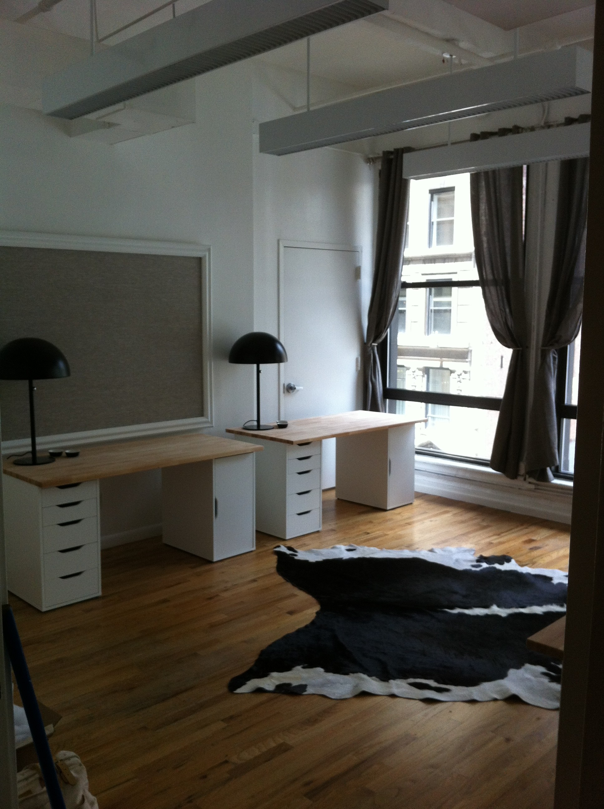
Obvi, chairs will move in along with computers and the other inevitable office trappings, but this baby is ready to rock and roll! I'm really pleased with how it turned out and more importantly, my client (& her staff) have had their new office dreams AND destinies fulfilled! What more could I ask for in life, y'all?
It's time to get down and DIY dirty, y'all, with some hot bulletin board action...here's what we're making, in case y'all are too lazy to click to the last post: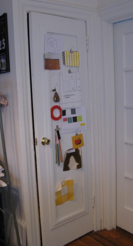
Here's what y'all need to do:
-measure out your inset panel, height and width, or whatever area you want to create a bulletin board in...and then measure it again...of note: this area should be at least 1/2" deep, if you plan on insetting a bulletin board into it and then framing it out...this will make more sense later, keep reading...
-get yourself to a home center or building supply store to purchase the following:
* homosote (hee, hee...I typed HOMO y'all!) This is the material that will become your bulletin board. It's normally used for soundproofing and it comes in 4' x 8' sheets (1/2" thick) for around $25-$30 per sheet. Homosote is a great material for bulletin boards b/c it's cheap, extremely durable and can be painted or upholstered to suit your style. Check this guerilla footage of me cutting my homosote right in the Home Depot PJcuttinghomosote, shot by the uber-talented genius, Chris White Here's what I ended up with:
 *molding/trim- y'all can get as fancy here as you like, I chose a more classic, simplistic profile to stay in line with the existing architecture of my apt so the look is more seamless when completed:
 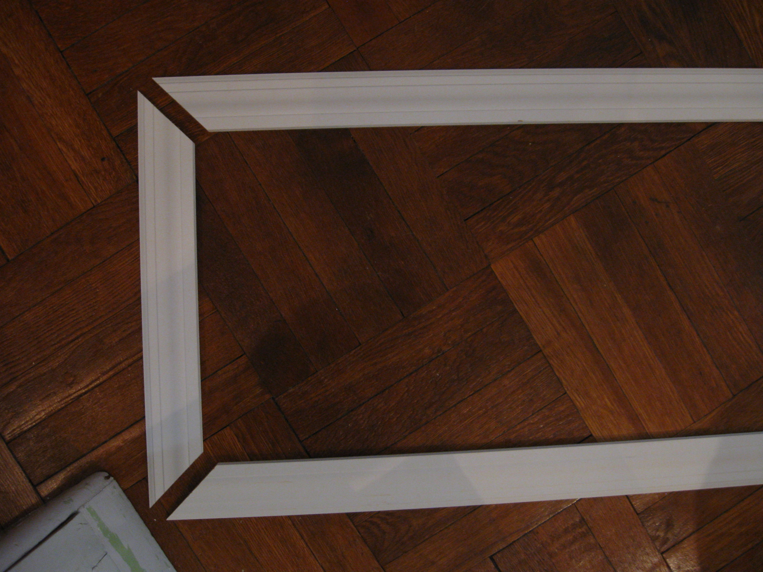 Trimming your bulletin board out isn't necessary, but it will give you a much more polished look. You're basically making a picture frame for your bulletin board, like this:

This requires cutting the trim using a miter saw. If you aren't comfy doing this, see if you can bat your eyelashes or push up your 'girls' or 'boys-- whatever you're rockin'-- and persuade an associate at home center to cut trim for you in the dimensions you need. You can also purchase a miter box and handsaw kit that's really easy to use and less drama than a power tool.
*construction adhesive
*finishing nails,countersink & wood putty
*hammer
*level
*paint and/or fabric & batting, staple gun
Once you've gotten your goodies, it's time to get your construction on.
*Apply small dime-sized blobs of adhesive to the inset area on door. Next place your piece of homosote carefully into the panel and hold firmly for a good 20 to 30 seconds. Kind of run your hands all over that shiot to make sure the adhesive blobs spread out and begin to work their sticky magic.
*Next, line up your pre-cute molding/trim to one side edge, the trim should slightly cover part of the cut edge of bulletin board AND the door. Be sure the length of molding matches up to the length of the seam you'll be covering...test that the top piece of molding fits at a perfect 90-degrees when held in place to the side edge molding piece.
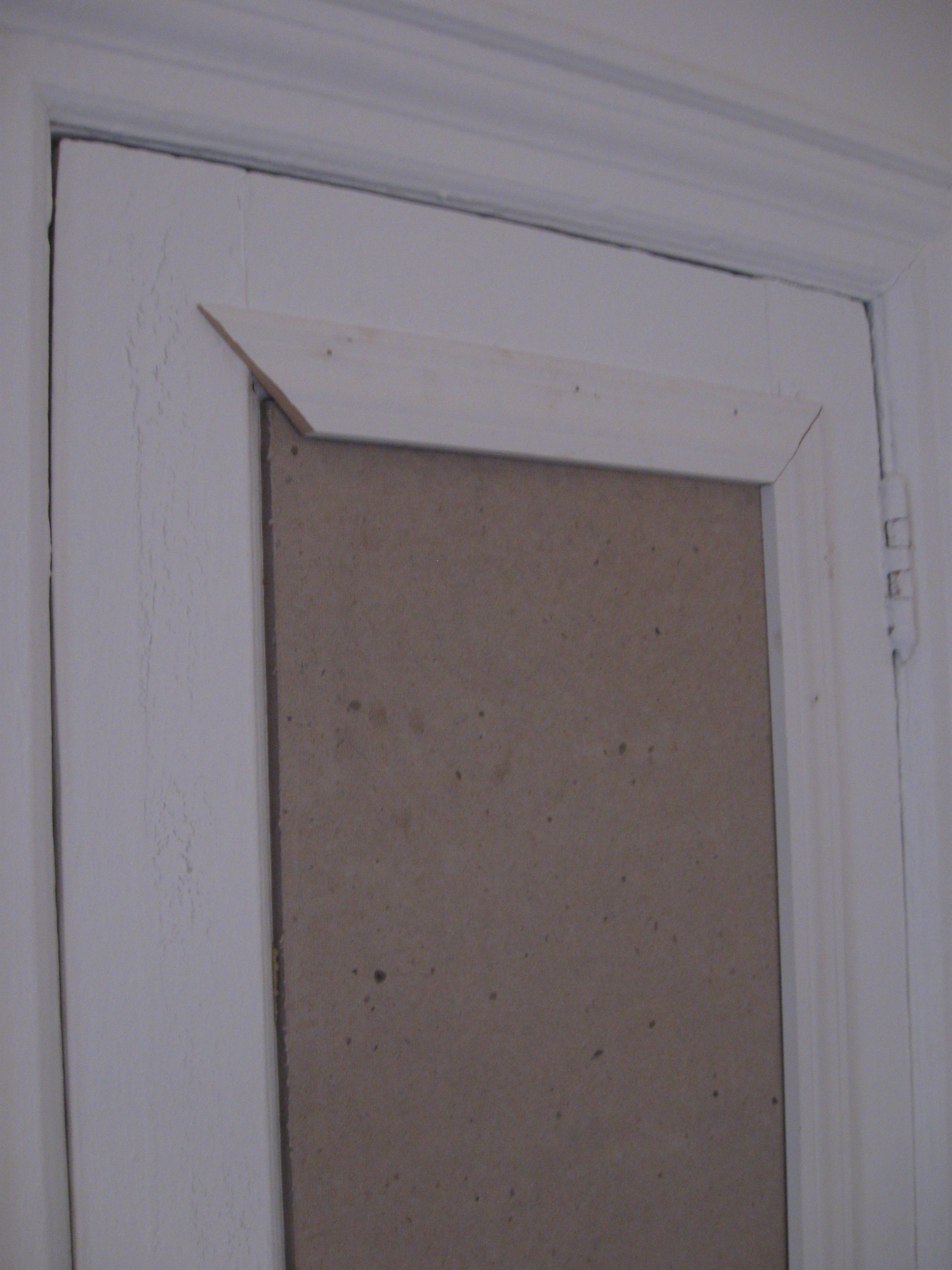
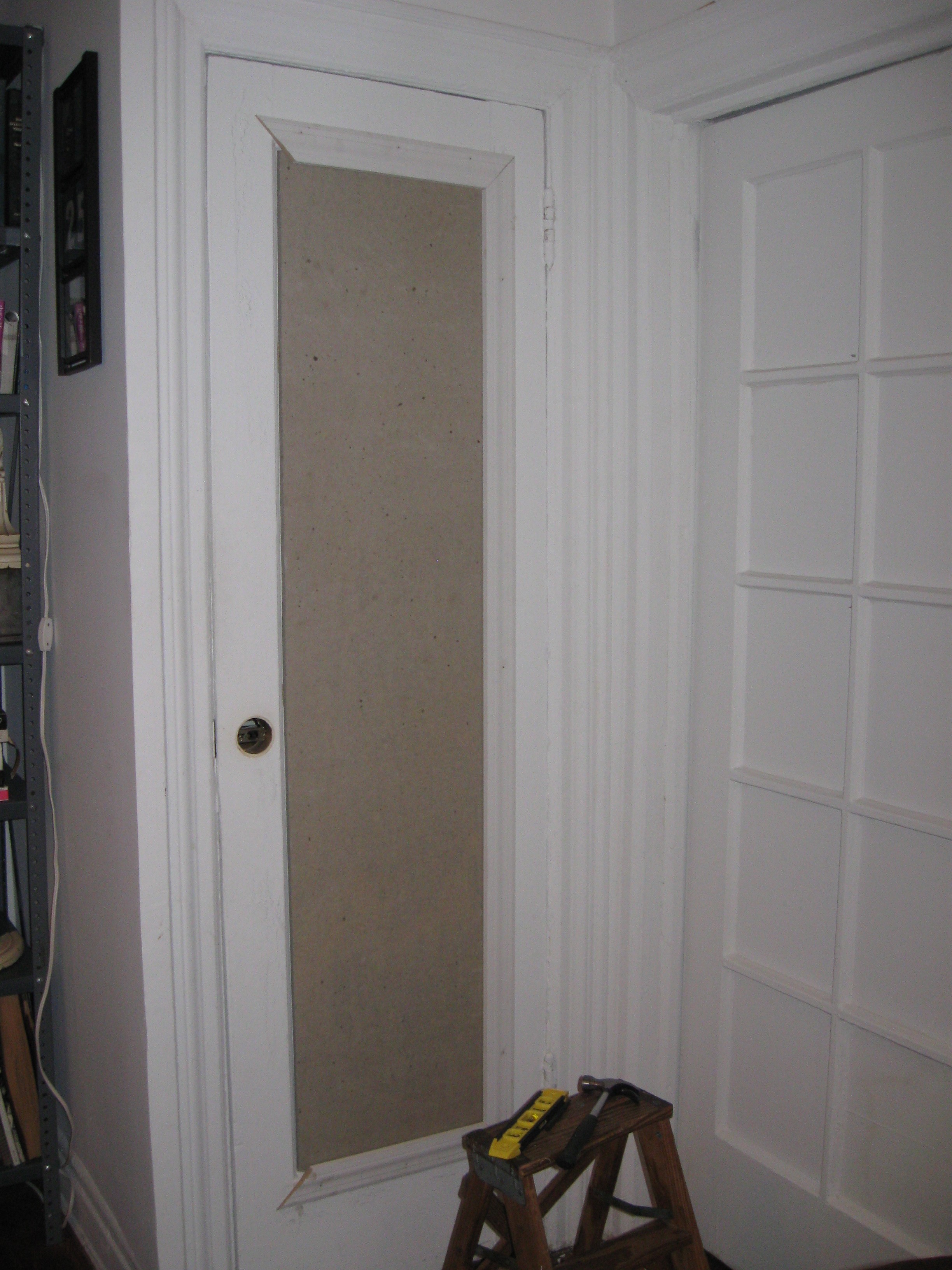 If y'all have a doorknob that you want to cut around, carefully remove the doorknob. Holding your piece of molding in place on the front side, carefully trace the curvature from the backside-- through the existing doorknob hole-- make sense? Cut away curvature from the trim. Now, nail your finishing nails every 12" or so, through the molding into the door. Countersink them. Fill with putty, let dry and sand. Fast tip: y'all can use a drywall spackle in place of wood putty for filling the nailholes-- it dries faster, and it's paintable! Here's what I've got:
 If y'all don't want to paint your bulletin board, you can upholster it...you'd do this BEFORE you install your trim. Wrap your board with batting, then your fabric of choice and staple. Super easy.
Now this is what I call a BULLETIN BOARD!!! (Note: I use t-pins in place of more traditional push pins b/c I like how they look and since they're so long/strong, I can pin up a lot of shiot without them popping back out at me!)
 I love how it turned out and the fact that I have this much more space for my pinning pleasure is incredible! Remember, I also did the same project on the backside of my closet door, here's what that looks like:
 I'm not gonna lie to y'all, this project will take a minute, but it's totally worth it! Remember to always measure twice and cut once! Now go get your bulletin board on!!!
 You’ve most likely heard the edict, ‘Make your walls work for you’ and if you haven’t, well, then…make your walls work for you. But I’m going to get all kinds of cra cra on yo asses and declare, ‘Make your doors work for you!’ Uh huh! Scandal!
Y’all didn’t realize your doors could do more for you than just open and close? Oh Dahling…have I got a post for you…
With my ever-expanding style empire, ahem ahem, I found myself in need of a large bulletin board. Y’all know, to pin up all that style and what not. But since my apt walls are almost filled to capacity, I was going to have to get creative and carve out another spot for my pinning pleasure. Hello closet door! Just behind my desk in my office area, is my prop closet with a door that has a inset panel just begging to be used!  At 1 ft wide and over 5 ft high, somebody just got themselves a big ole bulletin board. Actually, TWO b/c the back of the door has the same inset! Now, that’s what I call a double style backslap! But before any slapping can begin, I've got work to do...and so will y'all when you decide to take yourselves there and make this tangy treat for your space...check back tomorrow to get all the dirty DIY details...yummy!
 More often than not, I find myself mired in some sort of decorating dilemma or another. I'm looking for a certain THING for my apartment, a lamp, a coffee table, window treatments...whatever it is. I scour the market trying to find what I want, and a lot of times-- like a lover-- I find the perfect match! HOT! But, usually, the solution requires that I take matters into my own hands...oh ecstasy! And that's when things get all d.i.y. dirty up in Patrician Court, y'all!
Such was the case when I was looking for a hallway runner. I wanted something patterned, narrow and long. Most NYC apartment hallways aren't these grand wide spaces that can accomodate the standard 2'.5" x 7' runners that you see all over the market. Even if you go for it, at best, you're getting the look of a stubby wall to wall runner and we don't generally respond well to stubby here at Blog-A-Dazzle. No, no. Besides, our hallway has a kick ass mahogany inlay, why would I want to cover up an inlay, y'all?!
Shut the &$ck you, I wouldn't! And neither should you!
So, my runner had to be between 18"-22" wide and at least 8' long. We'd found a temporary fix that was as plain jane as they come, but at least it was narrow AND cheap.
In the meantime I went hunting high and low for my perfect runner. And hunting. And hunting. Sweet summer skipped into azure autumn, leaves changed. Fall brought brisk nights, but no runner. Bummer. And then-- a random stop into West Elm changed my fate...forever. There, I found my runner...but not as I expected-- these things never are, folks-- it was a bath mat that seduced me!
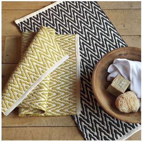
Gorgeously patterned, soft and supple, 20" wide, $29 dollars!...and...what? Only 34" LONG?! Cruel, cruel fate! But don't cry for me, y'all...with some simple d.i.y. enhancements I spurned fate and now...for under $100 bucks, I have the runner of my dreams...and y'all can too. Here's how:
1. Purchase the quantity of mats that will equal the overall length you'll want when finished. I bought 3 to give me a little over 8'. Of note: be sure you confirm the widths of each of your bath mats by holding them up to one another before purchasing...I found there was some discrepancies with widths, though minor, even though it's the same bath mat. The widths must match up to look seamless. Lay them out on floor, end to end and then carefully remove the seams of the ends that are being joined, with a seam ripper.
2. Iron flat the loose ends of each bath mat that you removed seams from. Then, align them front to front.

You choose which sides you want to be your front. The pattern is on both sides of the mat, so see which two mats can match up as perfectly as possible...those should be your fronts. Note: the opposite end of your mat is already finished with a hem, so you can simply let that hem dictate which side is your front. Otherwise, you'll have to re-do that end hem as well if you switch it.
Pin the loose ends together, on the back side, being mindful to line up patterns. (I used T pins b/c the mats are somewhat thick and textured).
3. Carefully sew the two ends together. Be mindful to remove T pins as you sew. Go slow with this, y'all, the mats are textured and somewhat plush, so don't force your machine...she'll get angry and stop working!
 4. Once sewn, lay rug, front side down. Iron out the two sides of your new seam.
Then trim off excess material.
Iron one last time and flip over your new rug, y'all! Safety first: make sure you use a non-slip rug pad and enjoy...our dog Brandon sure is!

It was a mere four days ago that our kitchen cabinets were serving some heapin' helpins of 'oak' horrendousness, only to be transformed with a super-easy paint job! Our kitchen is lighter, brighter and feels brand new! And shut the &$ck y'all, this makeover only cost me $60 in supplies! Now, this is what I call yummy, y'all!
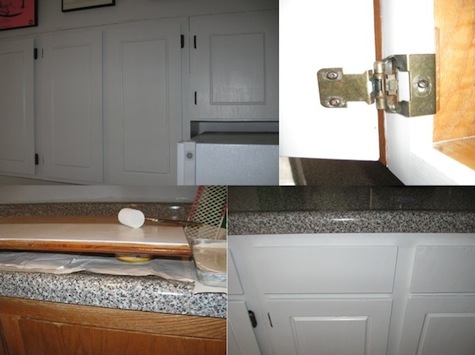 Y'all, I'm well on my way to one sweet & sassy kitchen! The process has been smooth-sailing 'cause I'm totally in my 'paint place'-- that mindless, in-the-groove, itunes on, paintbrush-as-microphone place...we ARE a part of a Rhythm Nation, y'all! Sing it 'cause you want a better way of life-- through painted kitchen cabinets! And scene...
Y’all will notice I’m only painting the exterior doors and drawers. I wanted this process to be as easy and stress-free as possible. This may seem a little janky, but I don’t care how golden-y-oak the interiors are. For me, it’s all about the aesthetics on the outside…which, incidentally, also happens to be my philosophy about people. Oh shiot-- He didn’t? Oh, he DID y’all!
But, in all seriousness, painting your cabinets is probably the cheapest and easiest way to completely change the look of your kitchen, thereby giving you more drama than you can possibly ingest in one sitting. Just how dramatic you want to be is entirely up to you, but here’s how I’m getting my glam grove back into my cabinets:
1. Prep cabinets by giving them a light sanding and then a cleaning to remove dirt/dust. (Since I had thoroughly scoured my cabinets before—and in the process taken off most of the varnish, I didn’t need to sand them). Y'all can always opt out of sanding completely, b/c it's a total pain in the ass, but then you absolutely have to use the primer product detailed in step 3.
2. Remove cabinet doors and drawer faces. Then remove hinges...I opted to tackle one section, or “box” at a time, for space-saving & sanity purposes. (FYI, your cabinets are actually separate, box-like structures, some with doors, some with drawers & some with a combo of both)
3. Prime everything that you’ll eventually want painted with one coat of BIN Primer Ultimate Stain Blocker made by Zinsser. I have no clue what this stuff is made of and it will most likely be around long after any of us are, but it’s amazing! It completely covers any and all imperfections AND apparently eliminates having the need for any sanding whatsover! The can even says it covers “fire, smoke and water” damage, for those of y’all who have cabinets that have been REALLY rode hard. I used a 2” foam roller, following the grain of wood. Where necessary, I used smaller, craft foam “brushes” in hard to reach areas.
4. Once primer coat has thoroughly dried, it’s time for the paint. I used Benjamin Moore’s Ben Premium Semi-gloss Interior Latex Paint in White. Same situation with the foam brushes and going in the same direction of wood. Once paint is completely dry, carefully replace all hardware and just gently run your fingers over your freshly painted work, experiencing a 'tender caresses' decorating moment like you wouldn't believe. YOU did this! Savor and be satisfied!