A mysterious bird takes to using our new Adirondack chairs as a toilet…find out how we shut that down!
Read MoreAggro Bird

General
A mysterious bird takes to using our new Adirondack chairs as a toilet…find out how we shut that down!
Read MoreY'all, to say that Sandy was beyond a biotch is putting it mildly. This gal had BIG plans for most of the mid and northeast and for some, sadly, it seems she's still not done with her 'reveal'. Dyl and I are so blessed to have made it through safe and sound... We sit, just awestruck, at some of the images we're seeing and stories we're hearing about here in NYC as well as New Jersey and further afield --- most seeming like they're straight out of some post-apocalyptic movie, not possibly real life. My thoughts and prayers go out to those who have endured such tremendous loss and devastation. God bless. And for those of you who have the means and feel compelled to do so, here's a link to the Red Cross where you can make donations... it sure looks like they could use it, as this recovery will be massive:
 So it is that the Barn has spoken and if you're looking for some hot new wares for your space I suggest you look no further than the new Pottery Barn catalog...uh huh, those Pottery peeps must be exhausted with all this new style they're slaying us with! Check this shiot:
All of this chic can be had at Pottery Barn...note that some items are internet/catalog only, so don't spazz out if you stop into the store and can't find some of these things! Happy Shopping, y'all!
Earlier this week I'd posted about repetition of pattern and how I was going to apply this technique in my own bathroom, gettin' all kinds of D.I.Y.-dirty on y'all...here's the pattern I'm working from: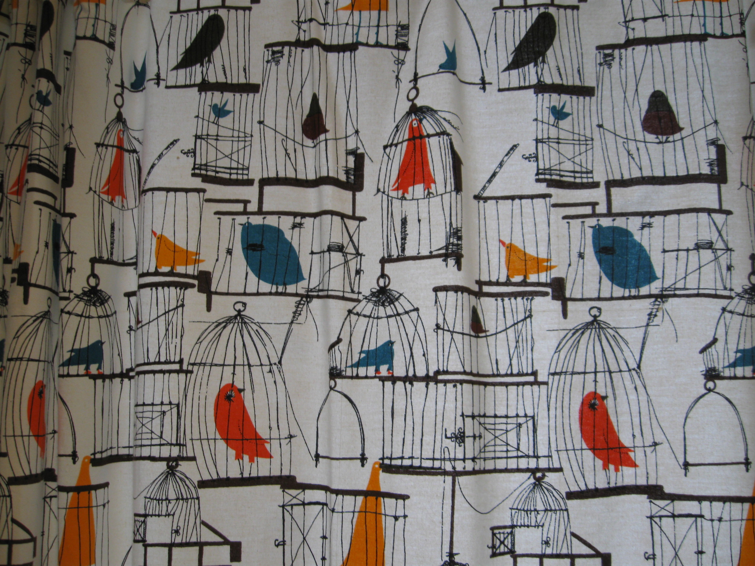
Here's what bathroom looked like:

Obvi, I decided to play with scale here, so my bird cages are a lot LARGER. I also deliberately left the birds out for fear of it going way too juvenile and I think this really works. Plus, this makes it much more conceptual, overall, since me and Dyl are now the 'birds' in these larger than life cages...and who doesn't like to get some cage play once in a while?! Chirp! Chirp!
I'm doing all this painting by hand and though exhausting, it's also fun b/c the pattern has a real line drawn/illustrated quality about it, so I can't really make any mistakes...well, I can and have, but they're easily corrected. Basically, it doesn't have to look perfect...it's interpretive of the original and it's super-quirky! My plan is to paint the other three walls in the same way, so check back for more progress updates and more detailed how-to action!
Y'all it's been bed bath and BEYOND forever since our last Disa episode-- so sorry!!! A cliffhanger was never intended for the season, but sometimes a telenovela like ours can get turned around-- y'all know how it is...decorating is DRAMA! What follows is a culmination of the past several visits (& projects) to Disa's Maplewood manse on our road to completion served up in one scrumptious video feast...savor it y'all! Massive holla shout out to Dylan, btw, who made this masterpiece possible...love you! Cue fog machine:
Sometimes I see things in this town that are just beyond genius and worth sharing...this window sign is one of them:
I have no clue why someone took the time to create this sign...it's an old store front in Brooklyn-- are they referring to their business going bust??-- but you can tell a lot of thought and time went into it... And the font is incredible!
Y'all, I often have moments in my projects (& LIFE) where I feel the exact same way, but I always try to find the silver lining & the positive, even when it seems like its the furthest thing from my grasp...ideas don't always turn out like we want or expect, but just being open during the process can often yield more genius then you ever thought you were capable of in the first place!
Y'all there are tons of things to do when family comes to visit in NYC, but one of the best, by far, is Dylan's Candy Bar!!!
There's all kinds of sweet treats to enjoy but even more decorating 'lisciousness to be had...look at all this yummy:
Talk about color and pattern inspiration?!? Or what about making your own custom candy light box, like those stairs-- genius! Or imagine a wallpaper accent wall done in THAT pattern?! And yes, this is a gumball tabletop-- incredible!
True that, y'all! Enjoy!!!
Y'all, it's time to get some full-on eye candy! The office is complete, woohoo, BUT before any hot reveal action can occur, have to let y'all know about a slight curve ball with the design plan/furniture solution. I'd found those awesome Ikea desk/combo units (see previous post for pic) which my client was totally on board with. But then she wasn't liking the fact that when configured in the space, they would partially block the inspiration boards that would be retrofitted over the existing soundproof windows. And baby just can't have ANY kind of blockage...ok? Y'all know that's right...flush IT! So, with some slight design adjustments, each worker will now get to rock these as their desks...
I love this new solution! The butcher block desk tops will give us warmth...the bases will serve us lots of yummy storage (hide those computer towers whenever y'all can, biotches!)...mix them all together and you've got yourselves some kind of sassy-chic-home-away-from-home PR/communications office realness!
And just so y'all know how hands-on I am with all my projects...take a look at this mini mountain that I was pushing around Ikea:

But trust that mountain was conquered and an office was born, y'all:
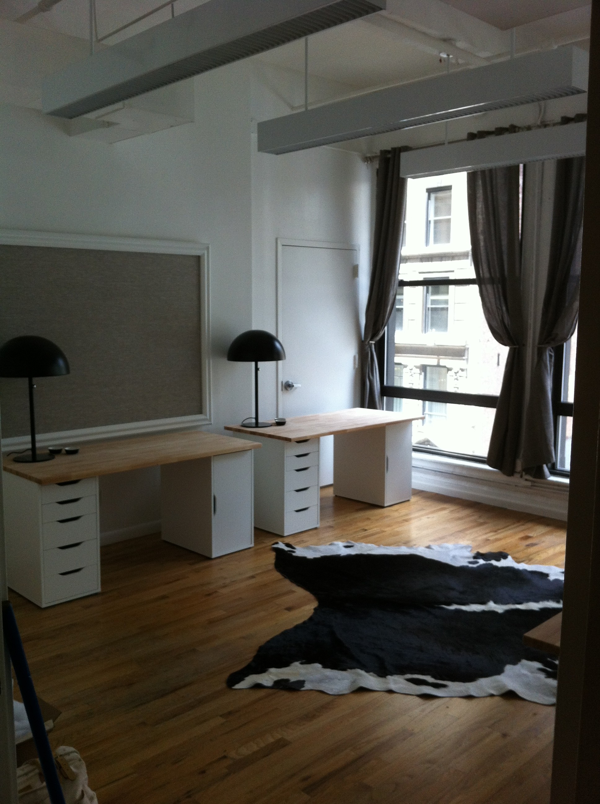
Obvi, chairs will move in along with computers and the other inevitable office trappings, but this baby is ready to rock and roll! I'm really pleased with how it turned out and more importantly, my client (& her staff) have had their new office dreams AND destinies fulfilled! What more could I ask for in life, y'all?
My client threw me a conundrum, or tried to anyway, when she tells me that she needs me to decorate her new office. For a staff of four. In one room. Short sentences with periods equal drama.
The pics are in the previous post...here's my plan of attack:
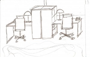
If y'all can't tell what in hell is going on with my sketch, here's the actual product sheet:

I love these cool Ikea desk/bookcase combo units! The lamps are just tres chic, no matter what day of the week it is. Cute cork and metal desk organizers. Clients' existing office chairs are gorg, so they're being re-used, which we love, not only for the environment, but also for the budget. And can we all just writhe around all over that cowhide rug? Go ahead, y'all writhe!!! YES! Clearly, I'm going for a very black and white/neutral color palette. Client is in PR/Communications...she's way hip and way savvy. I wanted to keep her workspace light and airy and unfussy. Let the color come in with her custom inspiration boards...oh, wait...I didn't mention those yet?
So, y'all saw the pics of the atrocious interior soundproof windows...I'm proposing we retrofit them as giant inspiration/bulletin boards! Made from what? C'mon y'all...HOMOSOTE!!! Call back! That's right, we're gonna just cut some homosote to size and take those odd windows and make them work for us! I'll upholster these with a nice neutral linen and frame them out with some chunky molding/trim...and since there are two windows in the space, this new office will score double bulletin board value so client can pin her PR & communications for days on end!
We'll just re-use the existing window treatments and give that space a fresh coat of white paint...and voila-- new office! Stay tuned for more process shots as it all comes together!
One of my interior clients needed a new office-- fast and cheap (like my lovers)! As most of y'all know, that's a challenge I'm always up for...sassy scandals! Oh and this room has to comfortably accomodate four peeps...here's the new spot: Uh-huh I've always taken issue with interior windows in spaces, but actually, y'all, this is a former recording studio, so those are actually pretty standard fare. It's soundproofed and hung on a weird angle, that you can't really see in the pics, but I've got a plan for that mess...here's more BEFORE office eye candy:


 Stay tuned to see my design solution(s) on how I'm going to make this space really sing!!!
It's time to get down and DIY dirty, y'all, with some hot bulletin board action...here's what we're making, in case y'all are too lazy to click to the last post: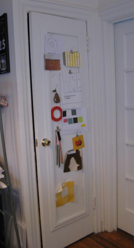
Here's what y'all need to do:
-measure out your inset panel, height and width, or whatever area you want to create a bulletin board in...and then measure it again...of note: this area should be at least 1/2" deep, if you plan on insetting a bulletin board into it and then framing it out...this will make more sense later, keep reading...
-get yourself to a home center or building supply store to purchase the following:
* homosote (hee, hee...I typed HOMO y'all!) This is the material that will become your bulletin board. It's normally used for soundproofing and it comes in 4' x 8' sheets (1/2" thick) for around $25-$30 per sheet. Homosote is a great material for bulletin boards b/c it's cheap, extremely durable and can be painted or upholstered to suit your style. Check this guerilla footage of me cutting my homosote right in the Home Depot PJcuttinghomosote, shot by the uber-talented genius, Chris White Here's what I ended up with:
 *molding/trim- y'all can get as fancy here as you like, I chose a more classic, simplistic profile to stay in line with the existing architecture of my apt so the look is more seamless when completed:
 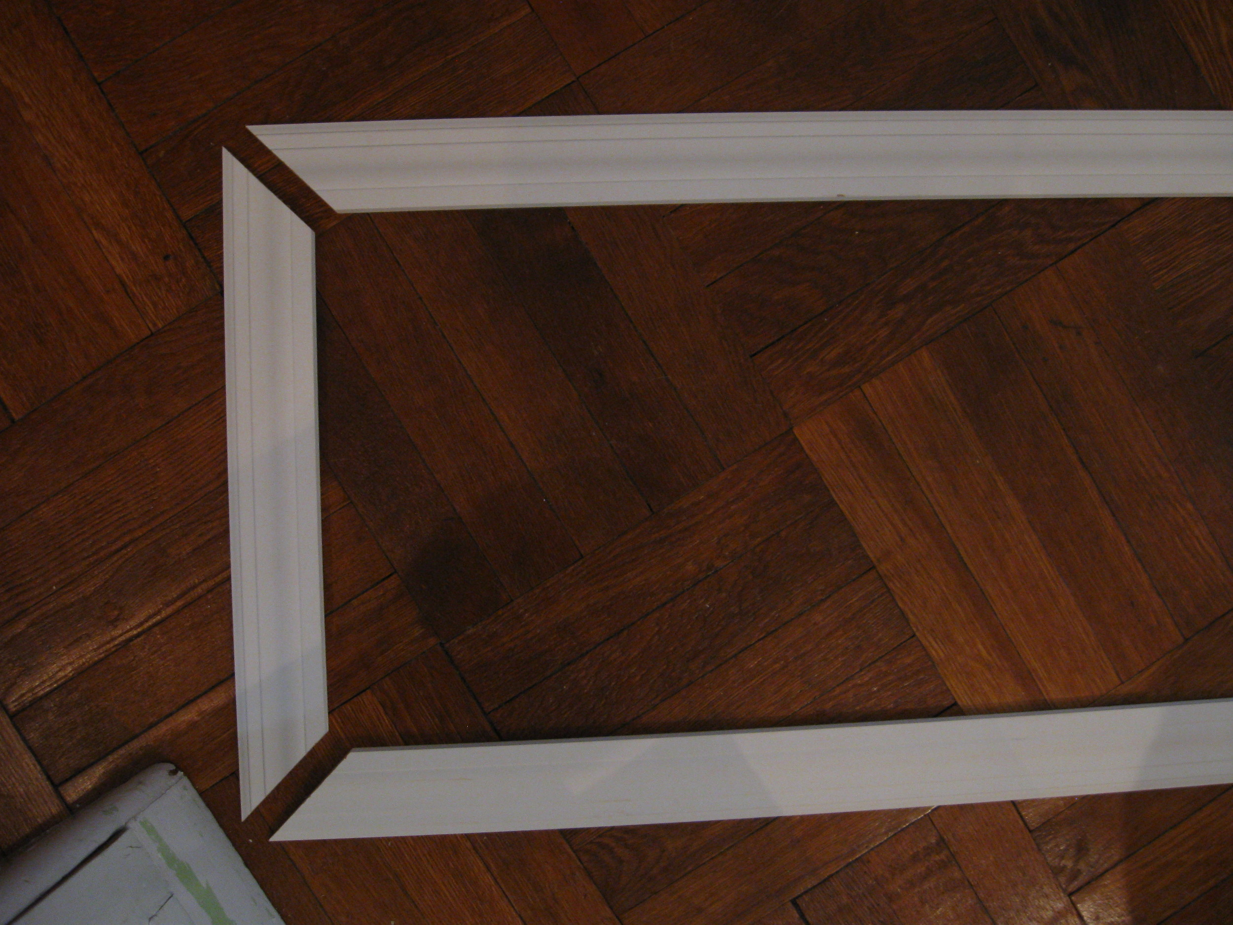 Trimming your bulletin board out isn't necessary, but it will give you a much more polished look. You're basically making a picture frame for your bulletin board, like this:

This requires cutting the trim using a miter saw. If you aren't comfy doing this, see if you can bat your eyelashes or push up your 'girls' or 'boys-- whatever you're rockin'-- and persuade an associate at home center to cut trim for you in the dimensions you need. You can also purchase a miter box and handsaw kit that's really easy to use and less drama than a power tool.
*construction adhesive
*finishing nails,countersink & wood putty
*hammer
*level
*paint and/or fabric & batting, staple gun
Once you've gotten your goodies, it's time to get your construction on.
*Apply small dime-sized blobs of adhesive to the inset area on door. Next place your piece of homosote carefully into the panel and hold firmly for a good 20 to 30 seconds. Kind of run your hands all over that shiot to make sure the adhesive blobs spread out and begin to work their sticky magic.
*Next, line up your pre-cute molding/trim to one side edge, the trim should slightly cover part of the cut edge of bulletin board AND the door. Be sure the length of molding matches up to the length of the seam you'll be covering...test that the top piece of molding fits at a perfect 90-degrees when held in place to the side edge molding piece.
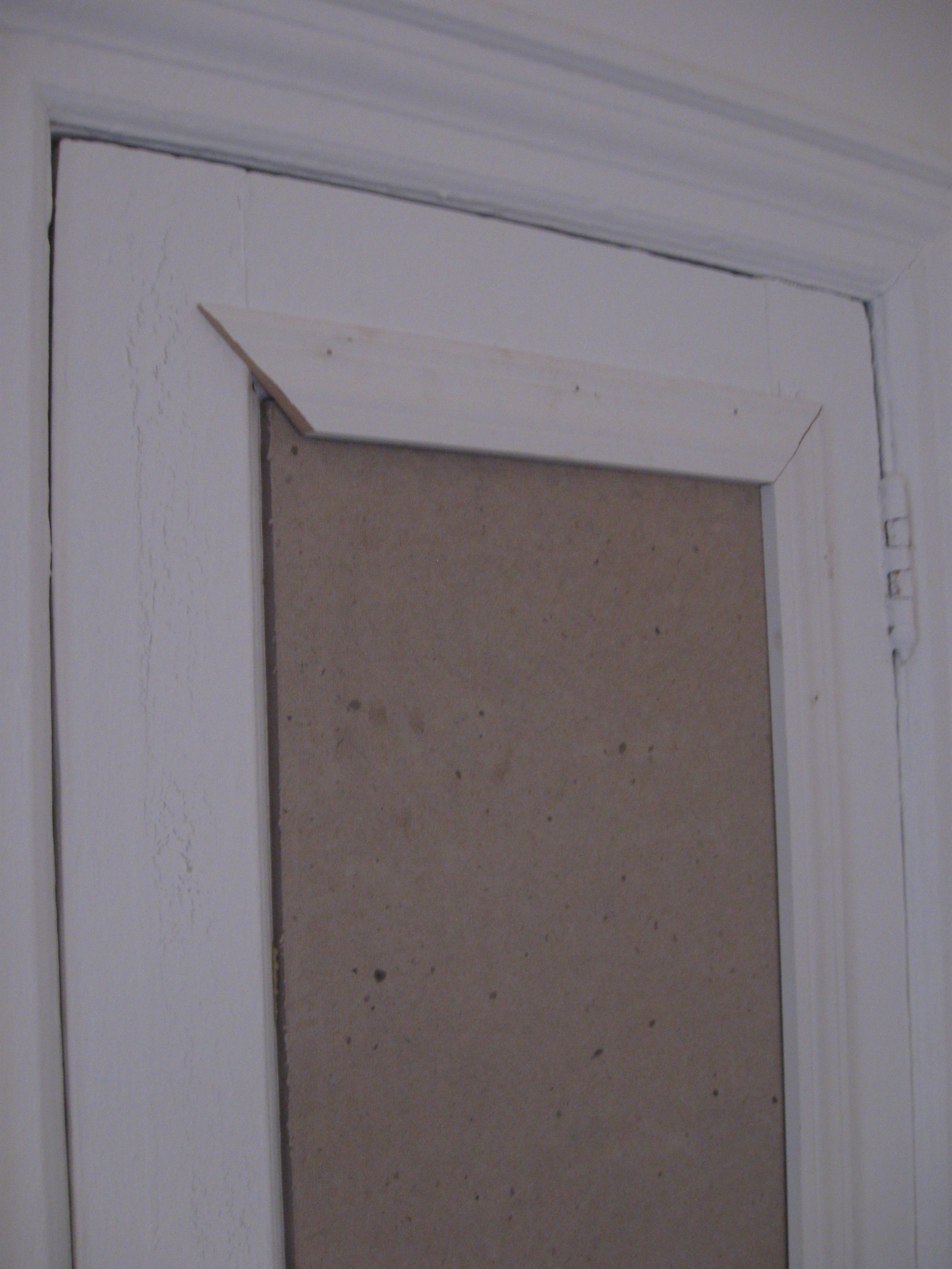
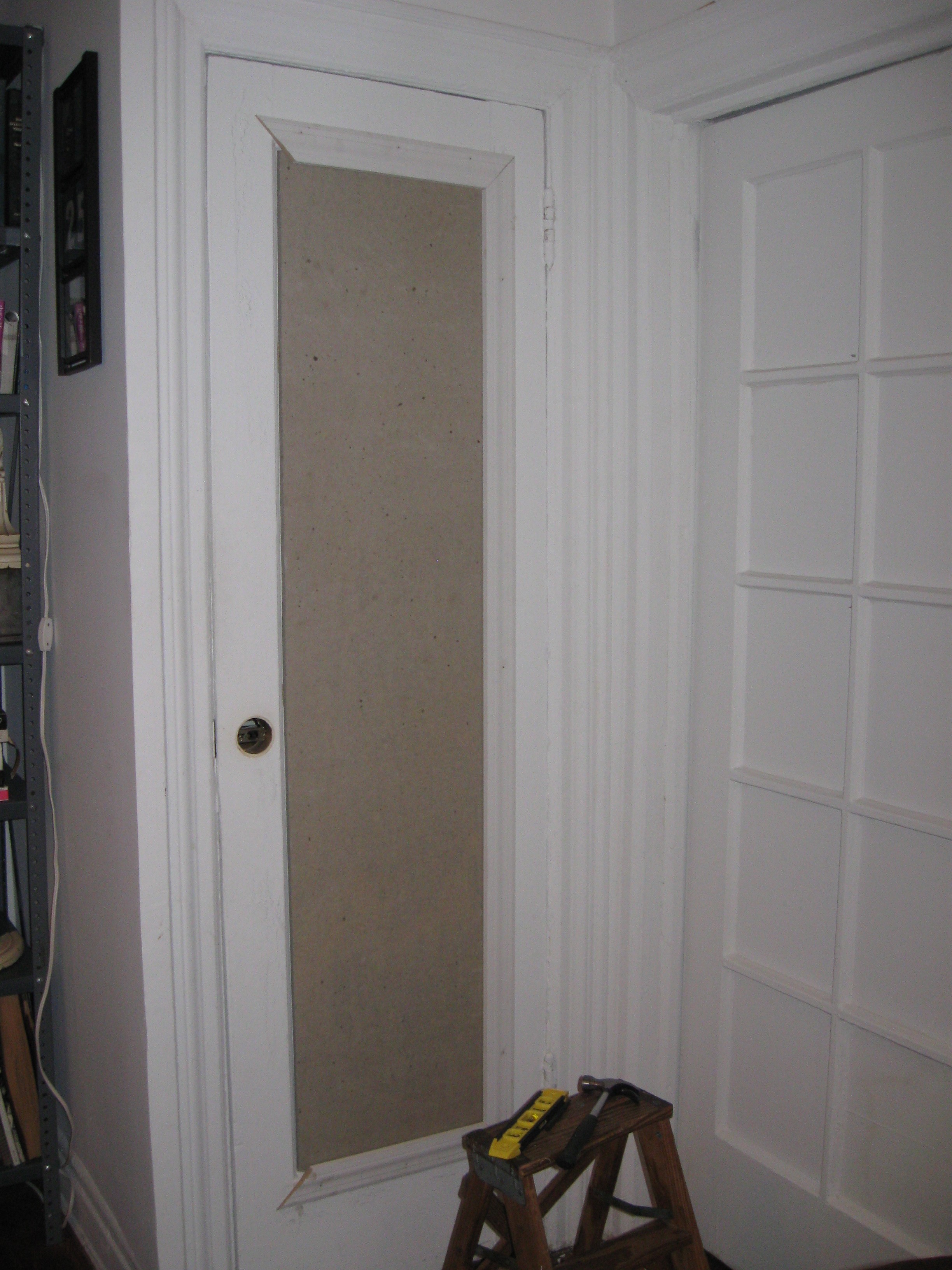 If y'all have a doorknob that you want to cut around, carefully remove the doorknob. Holding your piece of molding in place on the front side, carefully trace the curvature from the backside-- through the existing doorknob hole-- make sense? Cut away curvature from the trim. Now, nail your finishing nails every 12" or so, through the molding into the door. Countersink them. Fill with putty, let dry and sand. Fast tip: y'all can use a drywall spackle in place of wood putty for filling the nailholes-- it dries faster, and it's paintable! Here's what I've got:
 If y'all don't want to paint your bulletin board, you can upholster it...you'd do this BEFORE you install your trim. Wrap your board with batting, then your fabric of choice and staple. Super easy.
Now this is what I call a BULLETIN BOARD!!! (Note: I use t-pins in place of more traditional push pins b/c I like how they look and since they're so long/strong, I can pin up a lot of shiot without them popping back out at me!)
 I love how it turned out and the fact that I have this much more space for my pinning pleasure is incredible! Remember, I also did the same project on the backside of my closet door, here's what that looks like:
 I'm not gonna lie to y'all, this project will take a minute, but it's totally worth it! Remember to always measure twice and cut once! Now go get your bulletin board on!!!
En route to a beach housewarming party, Dyl and I put on our big girl panties to brave Target Atlantic Center on a Saturday. Which for those of y'all who've experienced this firsthand, you know I speak the truth...this isn't just some 'Dynasty' tv show drama...this is full on Tar-ghetto at its finest, y'all! Well, well, imagine my joy upon seeing this graphic greet us at the door:
Awww, that's a puppy after my own value-driven heart...y'all know biotch loves a bargain! And lo and behold, we found these wicker wrapped glasses on clearance that were just too cute to pass up, ruff ruff!
Have y'all ever beheld so much joy? That's not a glare from the glasses, oh no...that's bargain shining through!! HOT! And at $4.18 a pop, our new homeowner will have the happiest AND warmest home on the block! Cheers!
Y'all, the good folks at Ikea must just be beyond exhausted, what with all the style sass they're constantly serving us...just yesterday I was in the Brooklyn store and was style slapped by this new runner:
I'm just j'adoring the fun, poppy stripes of this beauty...AND the fact that she's a mere $24.99 is just icing on a cinnamon bun!!! (of which we bought a dozen before leaving the store-- oh shiot, yes!!!)
The rug is called Barbro Rand and it's 6'7"L x 2'x7"W...get more details here...I also love the fact that b/c she's a flat weave, I can customize her to fit whatever dimensions I need without all kinds of binding/fraying drama...genius!
So go on and get y'all some Ikea Barbro Rand action for an easy splash of summer style 'lisciousness...the yummy cinnamon buns are optional, of course!!!
 The art you choose to display in your space says a lot about "who" you really are... it's not just a style statement... it can be a real journey into the psyche of the folks who live there... sometimes that's a trip you're eager to take-- especially when we're talking about yummy vintage yarn art-- holla-- or, it can be territory that's best left uncharted. Meaning, anything incorporating LED lights. And scene.
Thankfully, the good peeps over at art.com have trusted yours truly to offer up my picks for adding some pizazz to your place... I tried to corral a varied collection of art, without loosing my style stamp of approval. Currently they're featuring a gallery of floral and nature themed art that I selected. Check out my gallery here (just scroll down and click my face - y'all know you want to)... even if my suggestions don't backslap you, you're sure to find something that will help tell the world who you really are!
Y’all don’t need me to tell you that NYC isn’t hurting for chic stores. That’s one of the best perks of my job is that I get paid to shop-- a lot. In doing so, I stumble upon some pretty amazing spots to get your style on. One of these is Modern Anthology.
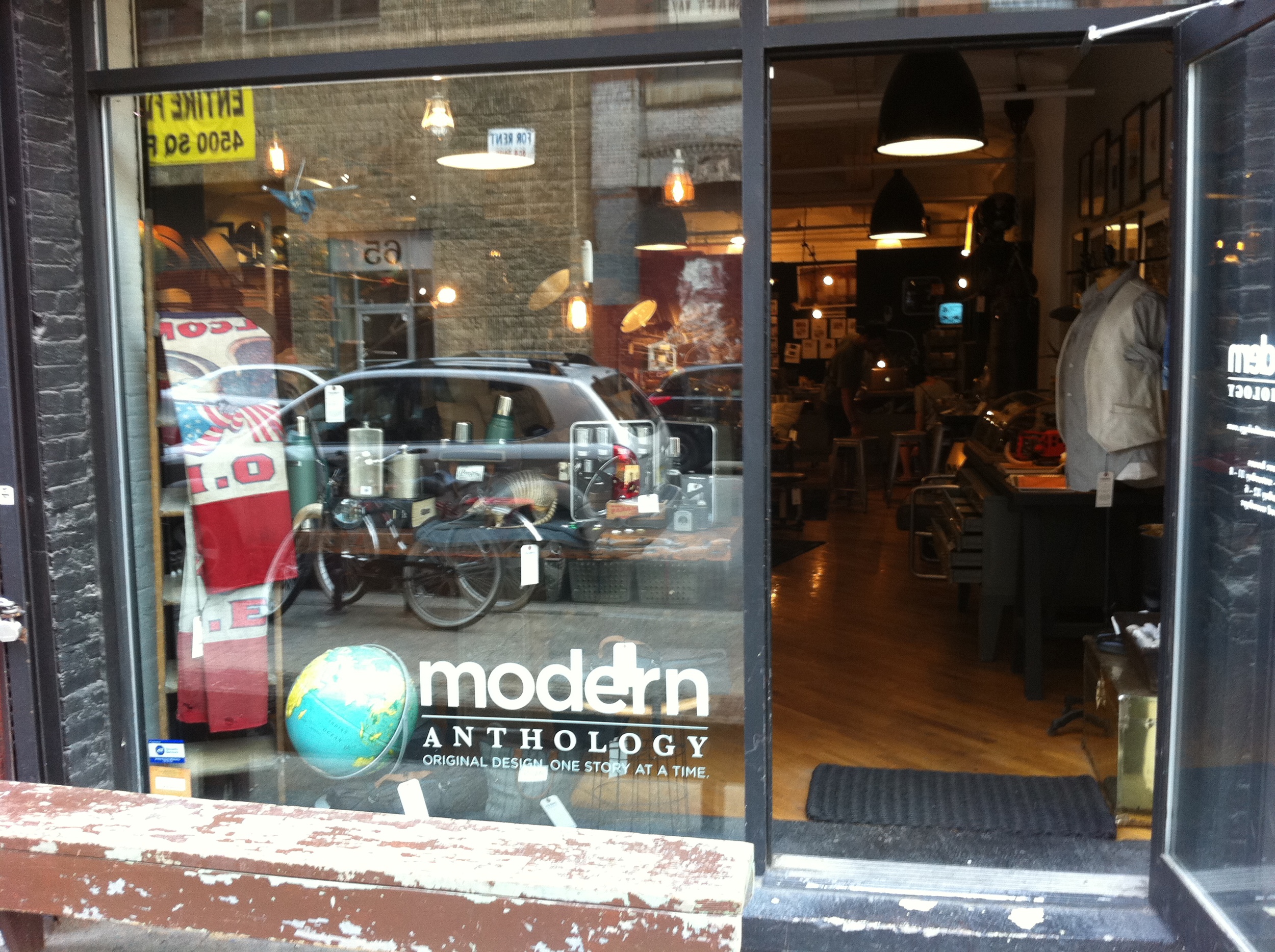
Billing itself as “creative agency + retail lab”, this a double value discovery b/c in addition to the amazing store, they’re also a design firm. Genius style slap! Located in the Dumbo area of Brooklyn, this has to be one of the best stores I’ve seen in a long time. There wasn’t a single item that I wouldn’t be happy buying. From clothing & bedding to furniture & accessories, the sophisticated selection is extremely well edited, merchandised and just…well, cool. Think: hip big brother’s room that’s no longer off limits!
The “lab” just oozes masculinity, which explains why I was drawn in to begin with—heehee-- scandal! Vintage clothing, accessories & industrial furniture pieces are seamlessly mixed with awesome new offerings. This is the place y’all come when shopping for a gift for the guy who, “already has everything”. But make no mistake, thankfully, the owners of this place are total EOA--- Equal Opportunity Aesthetes--- giving guys AND gals the perfectly curated spot for some stylish retail therapy! Well played, my friends.
Y’all, when it comes to collecting, I’ve been known to get a little--- shall we say, passionate?—about certain things.
Landscape paintings. Globes. Dansk candleholders. And for the past year or so, I’ve taken to yarn art. Yes!
Y’all know what I’m talking about, right? The often heinous, straight-out-of-the-sixties-and- seventies wall art & throw pillows, like this:
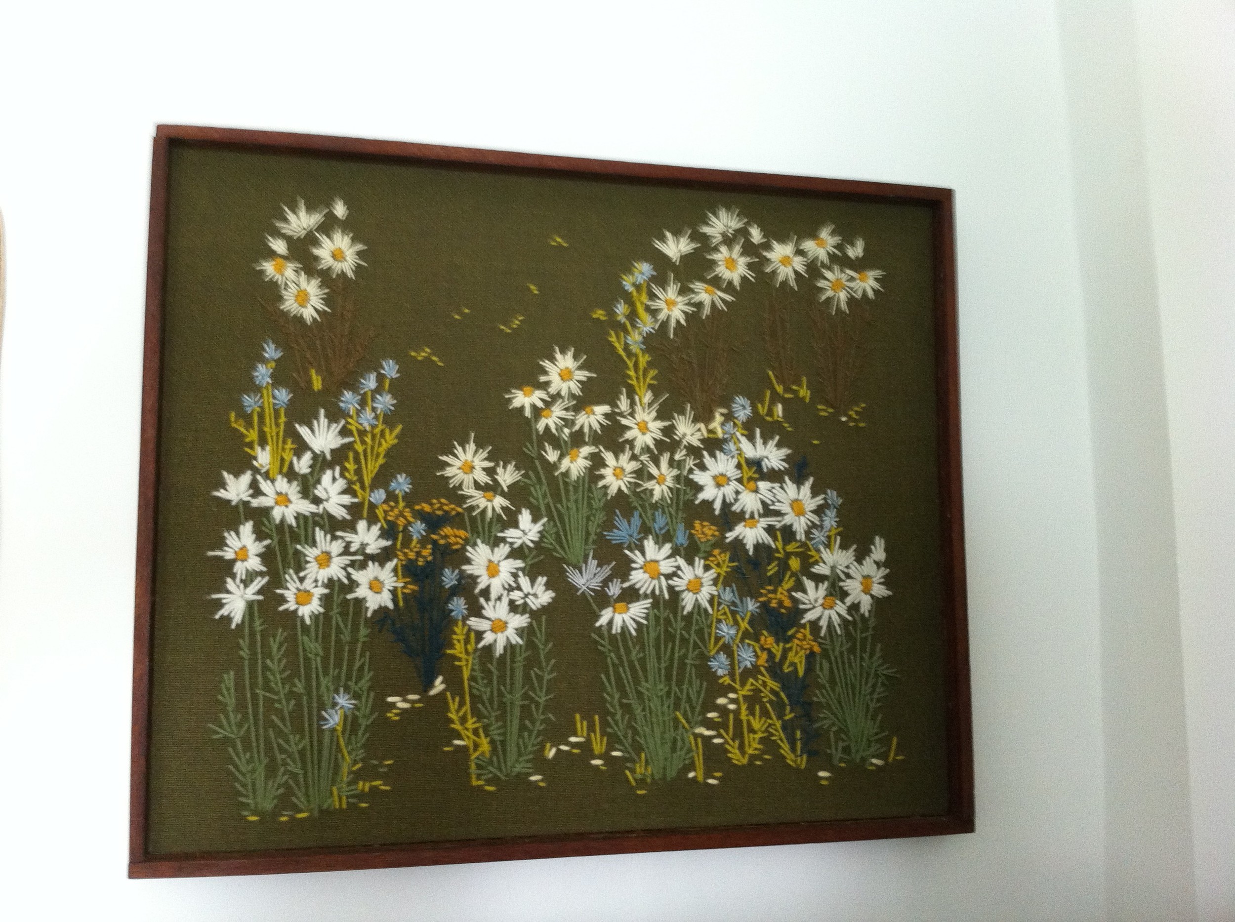
Besides just making me happy, this kitschy goodness is great b/c it’s usually really cheap and most importantly, it’s handmade. Knowing that someone, somewhere put a lot of love and attention into making it, puts an even cheesier smile on my face. And y’all KNOW I love me some cheese!
 Also, most of the pieces I’ve collected have a real graphic quality and since they’re made with yarn on linen or other fabric, they’re textural. This adds a fun dimension when layered with other artwork on a wallscape.
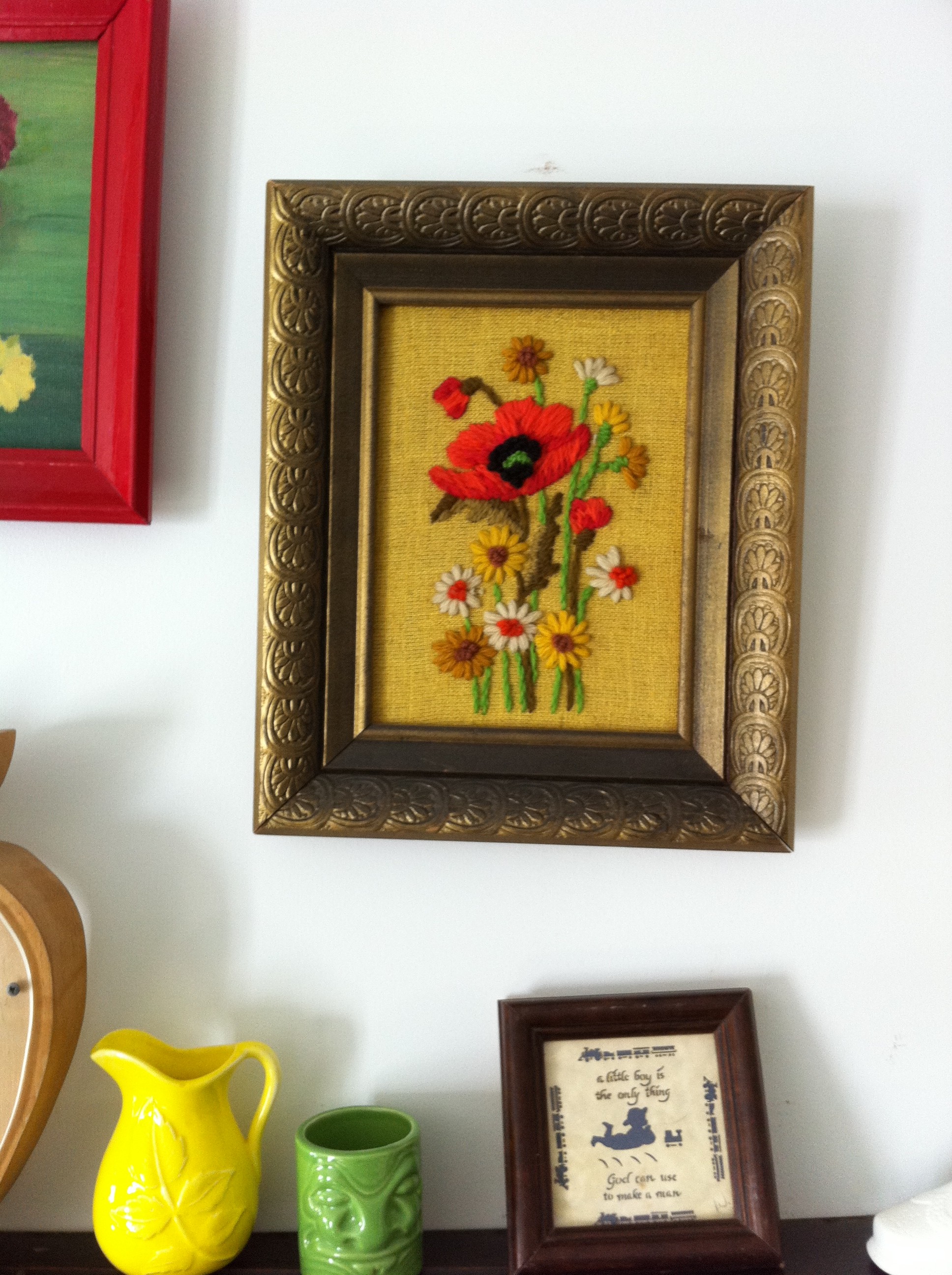
Recently, on a thrift store trolling session I was backslapped by these two lovely ladies:

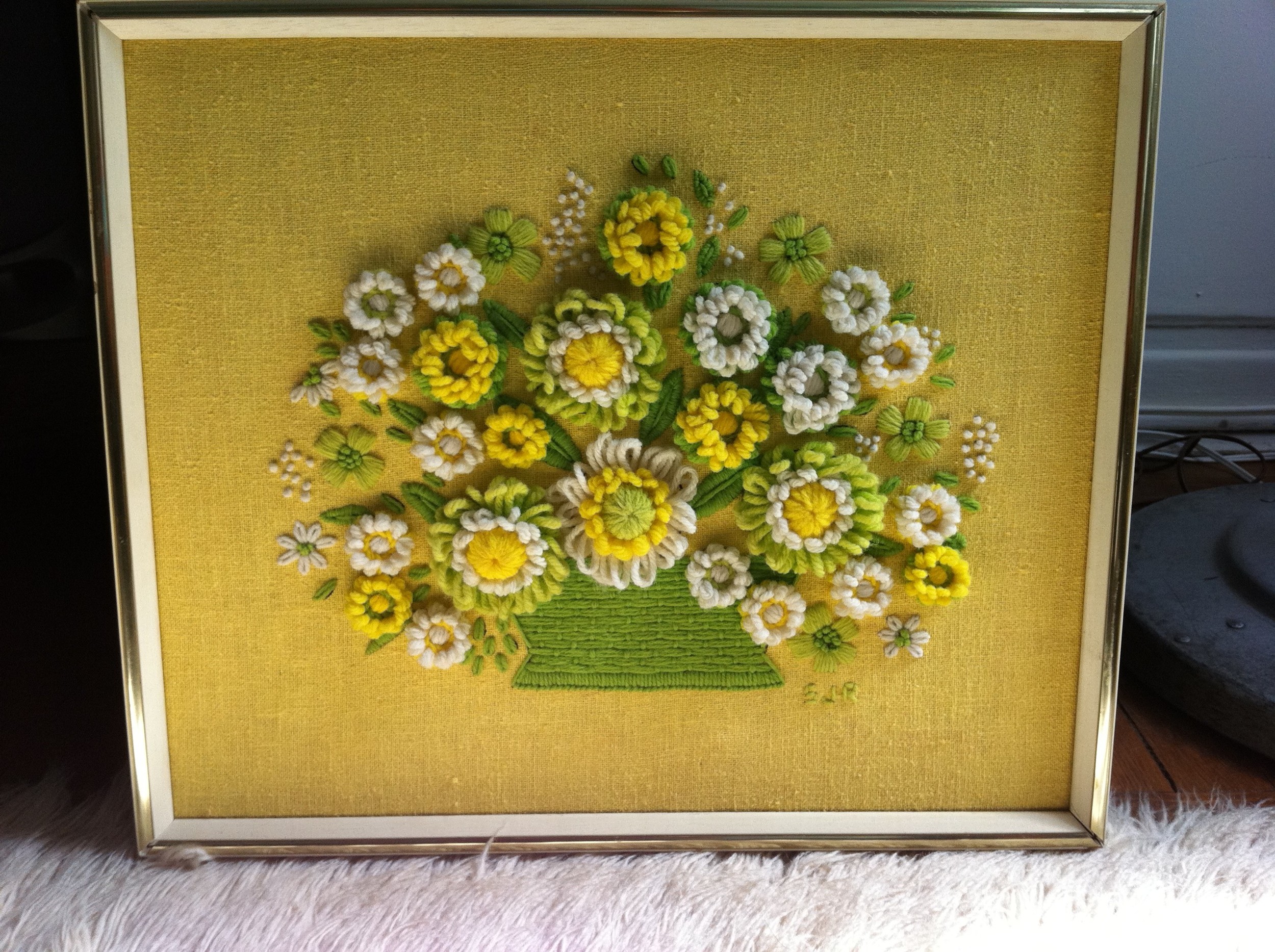
I don’t normally spend this much on yarn art, $55 & $45 respectively, but before I could even think twice about it, these gals jumped off the wall and landed in my shopping cart! (Don’t y’all just HATE that when that happens? WTF, Gals?!) But since this was a charity thrift store, this was a win-win for all of us!
And this goodness isn’t just limited to walls…check out these amazing pillows I’ve gathered: Delectable!
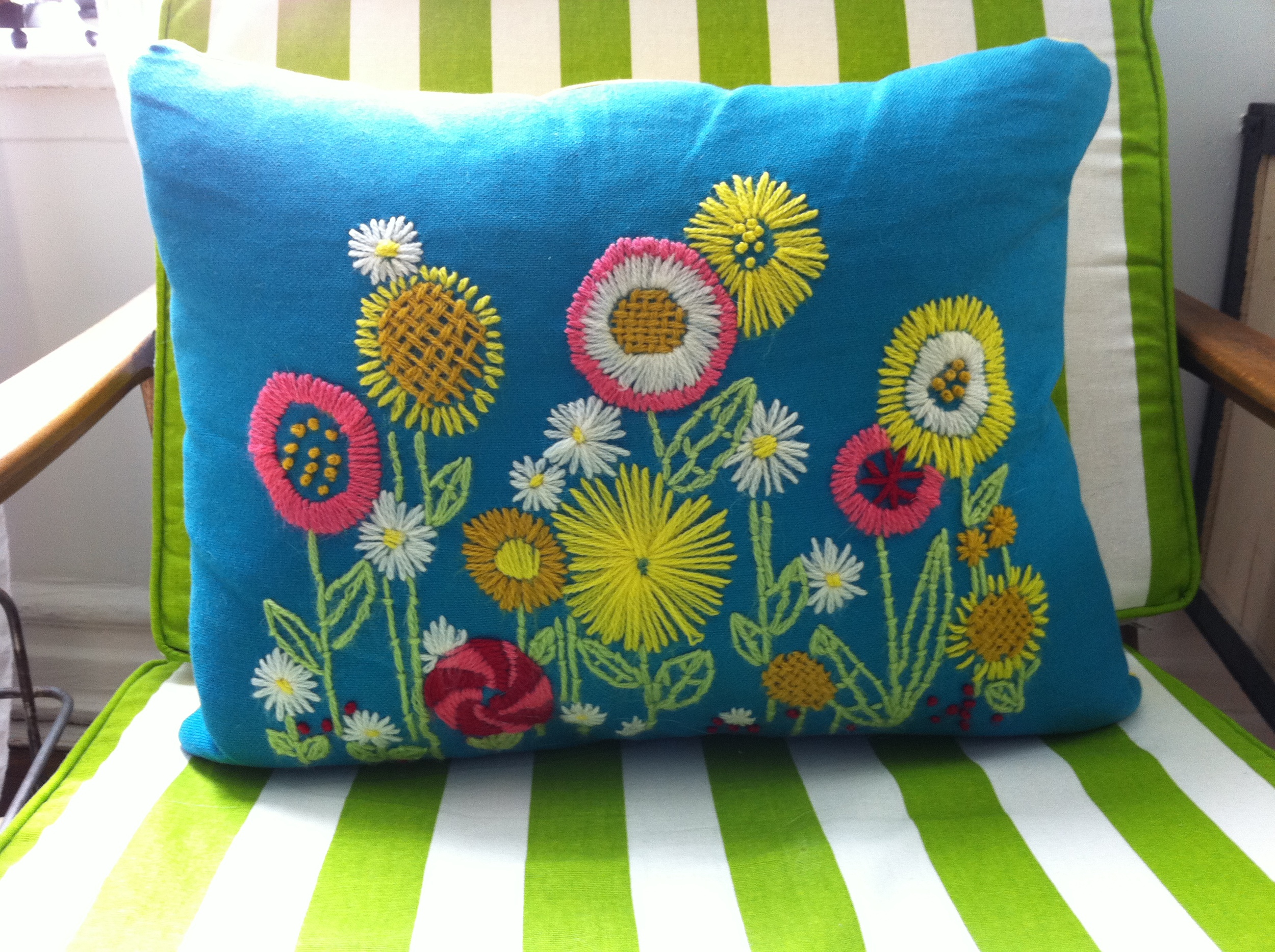


Now, y’all aren’t seeing things, some of this lusciousness I’m sharing is technically more embroidery, than yarn art, but it’s a thin enough line, or thread, in my opinion. And who the hell am I to suddenly get all tech-y on y’all? With that said, I’ve rounded up some treats of all thread-y types from the marketplace. Now go get your yarn on!
Mod Love Pillow by Jonathan Adler, $175
Pitcher of flowers by MerryMayFarm on Etsy, $12
1960s Rooster Picture Home Made by Stirlings on Etsy, $19.99
Sunny Day Needlepoint Vintage Picture on Linen by Bethanyg13 on Etsy, $15
Bargello Chevron Pillow by Jonathan Adler, $175
Keep Calm and Carry Yarn poster by JennieGee on Etsy, $20
Yarn Wreath Handmade Front Door- Orange and Cream, 12 in. by ItzFitz on Etsy, $40
Crewel Cat Pillow by August Morgan, $200
Dolly Parton Yarn Art by BrandyLynnAndPaul on Etsy, $200
So, y’all, get this: for the past four years (maybe MORE), I’ve been collecting fondue pots and forks with the grand and romantic notion of hosting fabulous fondue parties. In my various thrift store tours while traveling, I’ve scored three lovely pots and several sets of forks.

Gorge, right? And YES! Every single one I found is ORANGE! Now, if that’s not entertaining kismet, I don’t know what is… somebody, somewhere wanted me to fulfill my fondue dreams in a BIG, ORANGE way and I could no longer refuse the call.
So it was a couple weeks ago, that Dylan and I hosted our first, and definitely not last, Fondue party. We basically had no idea in hell what we we’re doing… which is my general method of entertaining. But after consulting with some of our more “hostess with the mostess” friends and the internet, we were bubbling over--- Ha! Ha! Hee! Hee!-- with intel.
Since we have three pots, we wanted to have three courses of foundue: cheese, oil & chocolate. That and we truly enjoy self-torture… why not thrust yourself headfirst into completely unknown territory, and invite some friends over to eat it? That’s what I call a party! We found easy recipes for not only the various courses, but also some zesty dipping sauces on gofondue.com. We made Classic Cheese Fondue, Hot oil (don't forget the dreamy dipping sauces) and Dark Chocolate, but there’s a delightful array of more recipes & helpful tips & tidbits.
After what felt like hours of chopping and dicing and grating, we were ready to wow our guests with the unique and exotic! And I’m thrilled to share that we did just that!
Just look at the sheer joy on this man’s face? I don’t think he’s ever tasted anything SO GOOD! But, WAIT, there’s more! Look at these guests here, beaming with full bellies of cheese and oil goodness? They’re positively gurgling!
Oh, is that dark chocolate teasing you?
IT IS! Go ahead, friends, dip a strawberry, won’t you? Indulge! This is four years in the making! Live! Eat! Double-dip!
All I can say is there was a fondue angel beaming upon us that night. Everything seemed to go off without a hitch. No one caught themselves on fire, no one got their fondue forks mixed up and ate the wrong meat--- at least accidentally! Steamy! And the fondue was actually really yummy. The wait or rather, the procrastination, was well worth it. I’ve lived & tasted my future, y’all, and it’s filled with Fondue!
Y’all, just when I thought an already amazing day spent shopping with Disa couldn’t get any better, I returned home yesterday to find the Feb. 2011 issue of Better Homes & Gardens magazine in my mailbox!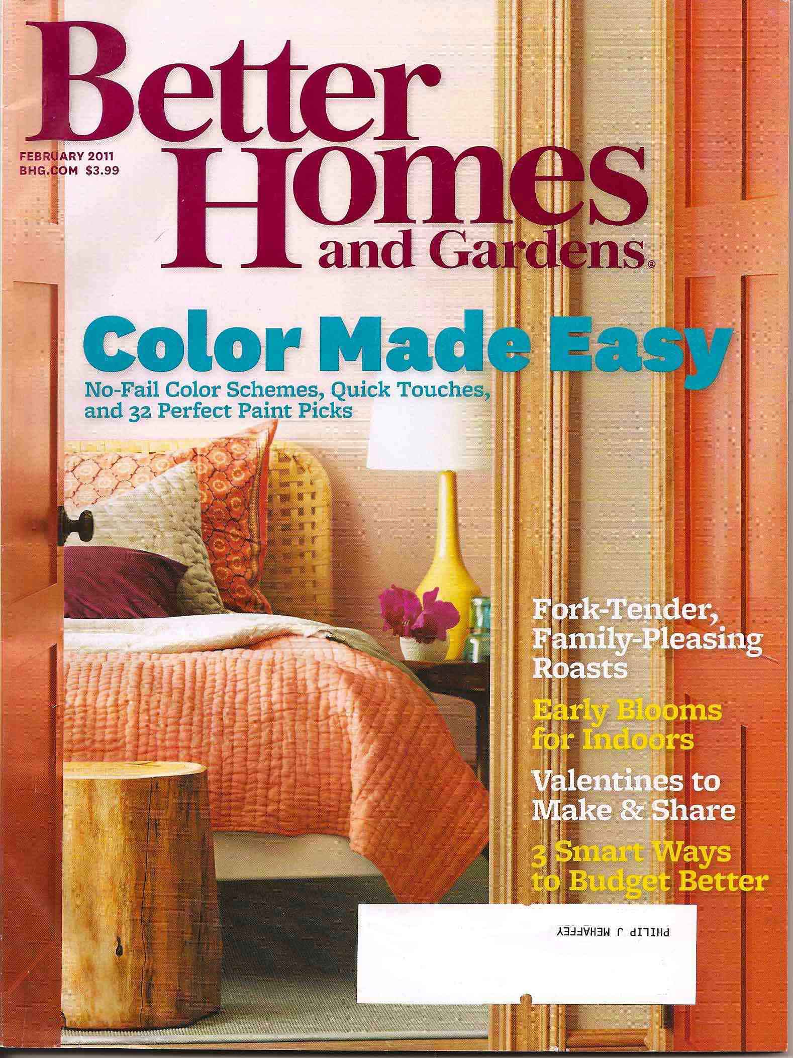 I don’t normally get so worked up about my magazines, but this one took me there b/c I co-produced the cover story, ‘Color is Refreshing’! Along with the amazingly talented Style Director, Stephen Perfetto, we turned it out, y’all. Of course, I’m a little bit biased, but I really think the story is not only beautiful, but filled with lots of yummy ideas about how to get & live with color. Shot by the incredible Kim Cornelison, get yourselves a copy and get some color in your lives!

Y’all, I got a cool opportunity this past week to do some crafting goodness for a Family Fun magazine Halloween segment on the Regis & Kelly Show! The crafts were super-cute and for the most part, super-easy! (Big southern shout-out to Dyl who sacrificed most of his weekend and several hours of sleep to help—Yeehaw, Dyl! You took us there!) The segment aired on Wed 10/27 and went really well. Y’all can watch it live right here. Once you click the link, you'll have to click on Videos and then scroll down to the "Pumpkin Alternatives" video. Enjoy! Now, I’m no stranger to being on a set, but live shows are an entirely different beast! Pun intended- Happy Halloween, Y’all!!! Scary! I wasn’t there on the day of the shoot, I had to come in the afternoon before to pre-set all the crafts and decorate the tables. Then, they just rolled the tables into place when they were ready to shoot the following day. As a stylist and control freak, this was a bit nerve-wracking— because whenever there’s tables with wheels involved, whatever pretty tablescape you’ve got going on, may not always be what shows up when it reaches it’s destination. But, all in all, I think everything looked great and of course, Regis (especially) and Kelly were hysterical to watch. Happy Halloween y'all!
 For those of y’all who take to living under rocks, may I introduce you to the amazing Lonny Magazine! Lonny is the genius brainchild of Michelle Adams & Patrick Cline, started one year ago this month. Happy Birthday Lonny, celebrate your design destiny!!! Lonny is an online magazine that “focuses on lifestyle and home décor”. The genius here, y’all, is its accessibility for not only inspiration, but also as a giant shopping resource - since, almost everything you see pictured can be purchased with the click of your mouse! I’m thrilled to share that I was asked to contribute to the current issue’s gift guide for dudes—y’all know, with my being a bit of an authority on men and all…oh, shiot!!! So, take a peek y’all—you’ll be inspired and can also get a head start on the often-challenging task of shopping for the men in your lives…yummy! (click here for Lonny goodness - my hotness starts on page 36 y'all!)