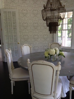
Y'all, TRUST that this GORG dining room didn't just wake up like this...
Read MoreGuess Who's Coming to Dinner?
Decorating with PJ
Y'all, TRUST that this GORG dining room didn't just wake up like this...
Read More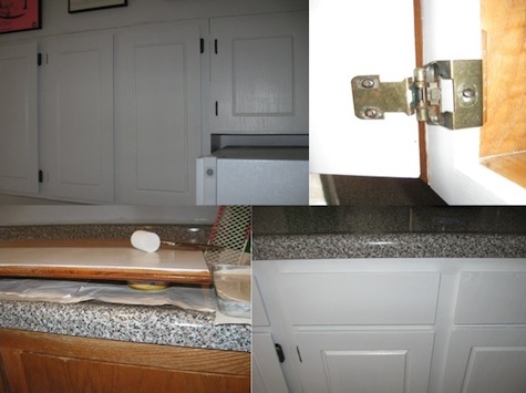 Y'all, I'm well on my way to one sweet & sassy kitchen! The process has been smooth-sailing 'cause I'm totally in my 'paint place'-- that mindless, in-the-groove, itunes on, paintbrush-as-microphone place...we ARE a part of a Rhythm Nation, y'all! Sing it 'cause you want a better way of life-- through painted kitchen cabinets! And scene...
Y’all will notice I’m only painting the exterior doors and drawers. I wanted this process to be as easy and stress-free as possible. This may seem a little janky, but I don’t care how golden-y-oak the interiors are. For me, it’s all about the aesthetics on the outside…which, incidentally, also happens to be my philosophy about people. Oh shiot-- He didn’t? Oh, he DID y’all!
But, in all seriousness, painting your cabinets is probably the cheapest and easiest way to completely change the look of your kitchen, thereby giving you more drama than you can possibly ingest in one sitting. Just how dramatic you want to be is entirely up to you, but here’s how I’m getting my glam grove back into my cabinets:
1. Prep cabinets by giving them a light sanding and then a cleaning to remove dirt/dust. (Since I had thoroughly scoured my cabinets before—and in the process taken off most of the varnish, I didn’t need to sand them). Y'all can always opt out of sanding completely, b/c it's a total pain in the ass, but then you absolutely have to use the primer product detailed in step 3.
2. Remove cabinet doors and drawer faces. Then remove hinges...I opted to tackle one section, or “box” at a time, for space-saving & sanity purposes. (FYI, your cabinets are actually separate, box-like structures, some with doors, some with drawers & some with a combo of both)
3. Prime everything that you’ll eventually want painted with one coat of BIN Primer Ultimate Stain Blocker made by Zinsser. I have no clue what this stuff is made of and it will most likely be around long after any of us are, but it’s amazing! It completely covers any and all imperfections AND apparently eliminates having the need for any sanding whatsover! The can even says it covers “fire, smoke and water” damage, for those of y’all who have cabinets that have been REALLY rode hard. I used a 2” foam roller, following the grain of wood. Where necessary, I used smaller, craft foam “brushes” in hard to reach areas.
4. Once primer coat has thoroughly dried, it’s time for the paint. I used Benjamin Moore’s Ben Premium Semi-gloss Interior Latex Paint in White. Same situation with the foam brushes and going in the same direction of wood. Once paint is completely dry, carefully replace all hardware and just gently run your fingers over your freshly painted work, experiencing a 'tender caresses' decorating moment like you wouldn't believe. YOU did this! Savor and be satisfied!
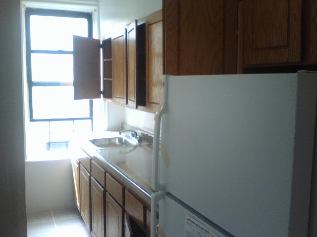 Y’all, one of the biggest projects off my apartment ‘Master List’ is painting our kitchen cabinets. Some poor soul, somewhere, thought golden oak cabinetry was just BEYOND glamorous. And then they went and punctuated it with bronzey-brass hinges! I just knew I was going to be greeted by a big ole shoulder pad when opening one of the cabinets for the first time! But instead of being served ‘Dynasty’, all I got was dead roaches and mouse droppings. And y’all know, that’s not the kind of drama I want coming out of my kitchen, oh no, shut the fu$% YOU! So, my first week in our place was spent scouring every inch of that kitchen beyond belief…yummy!
Fast forward to now: there’s been LOTS of drama in that kitchen and thankfully none that involve crawly-critters. I’ve begun to tackle the painting and it’s been going so well—I couldn’t be more pleased!

As y'all can see, I decided to go for a clean, simple and modern update by choosing white. There's also white in the "granite" countertop, so I knew I couldn't go wrong. I'm already backslapped by how great it looks and I'm not even halfway finished! The entire kitchen looks brighter and the cabinets look brand new. And y'all aren't even going to believe this, but I'm not even bothered by the brass hinges now b/c when paired with crisp white, their brass patina is chic! I said BRASS-SLAPPED! This is gettin' good, y'all...BUT WAIT, there's more! Be sure to check back-- I'll be sharing my progress as well as my step by step painting tips and tricks...tender decorating at it's finest!
 Math has never been a friend of mine…and I’m not sure why that is exactly. I’ve always dismissed our dynamic as "just not having enough in common". Math is so precise and exact. So right or wrong. There’s no wiggle room with Math. No drama or intrigue, no gray areas. I thrive in gray areas…I mean, what color doesn’t work with gray, right y’all?
For me, the same holds true for decorating—there is no real right or wrong. There’s an infinite amount of wiggle room, and nothing ever has to be exact or precise. So when I was approached to create a piece for Easy Decorating Magazine called 'Instant Room' that would illustrate basic elements (sofa, coffee table, light fixture & rug) added together to equal a specific style of room, I was a little skeptical. But I was quickly backslapped by Math... despite all her exactness (1 + 1 equals 2...blah, blah, blah) I discovered there’s a lot of wiggle room, you just have to be open to it. And just like decorating, being open to the unexpected can make for one hell of an equation. Look how these rooms add up:
Now go get properly schooled by grabbing yourselves a copy, out on newsstands now! Holla!
Y'all, get your Disa decorating fix with this latest video update...
Y’all, when it comes to collecting, I’ve been known to get a little--- shall we say, passionate?—about certain things.
Landscape paintings. Globes. Dansk candleholders. And for the past year or so, I’ve taken to yarn art. Yes!
Y’all know what I’m talking about, right? The often heinous, straight-out-of-the-sixties-and- seventies wall art & throw pillows, like this:
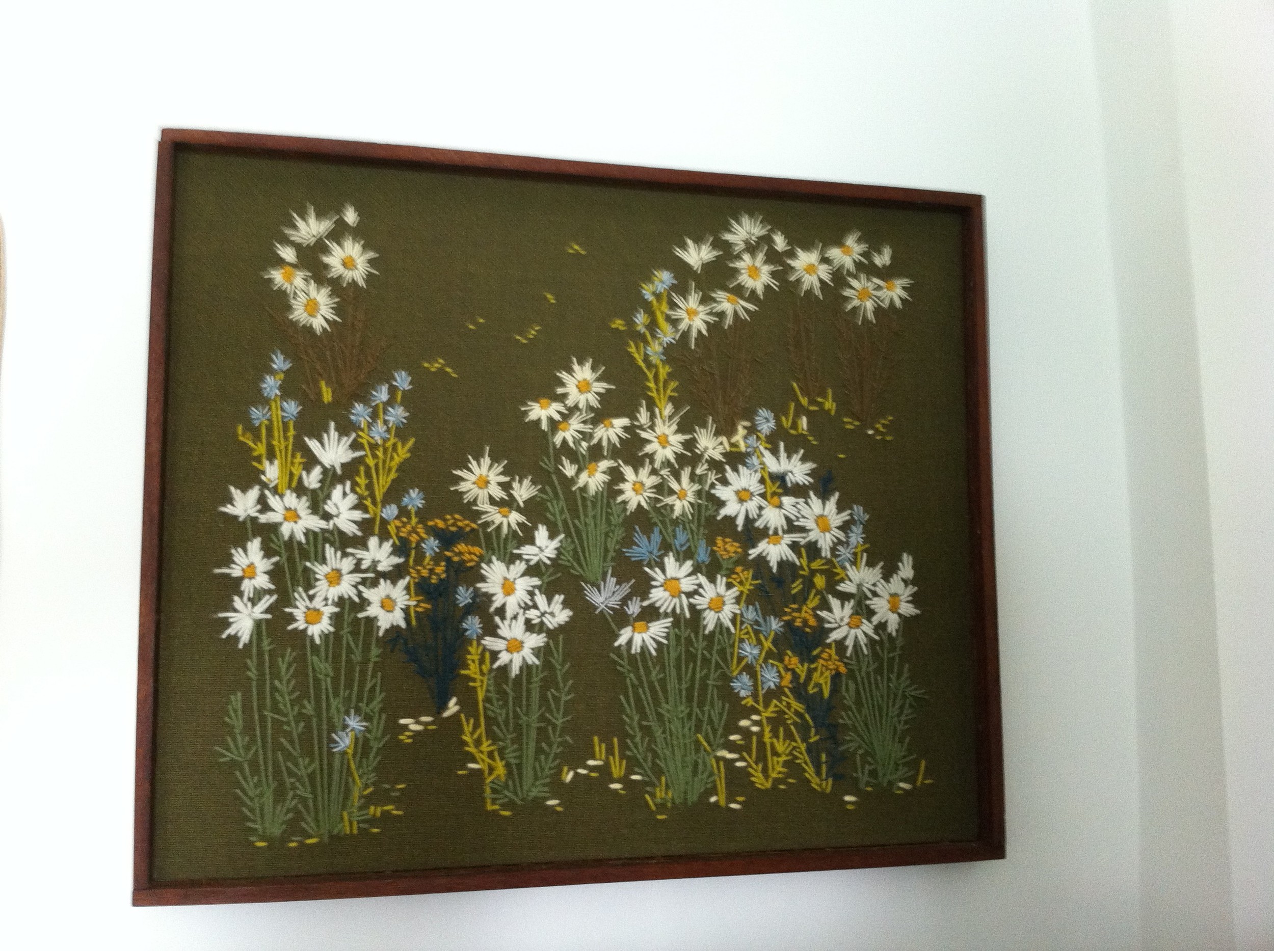
Besides just making me happy, this kitschy goodness is great b/c it’s usually really cheap and most importantly, it’s handmade. Knowing that someone, somewhere put a lot of love and attention into making it, puts an even cheesier smile on my face. And y’all KNOW I love me some cheese!
 Also, most of the pieces I’ve collected have a real graphic quality and since they’re made with yarn on linen or other fabric, they’re textural. This adds a fun dimension when layered with other artwork on a wallscape.
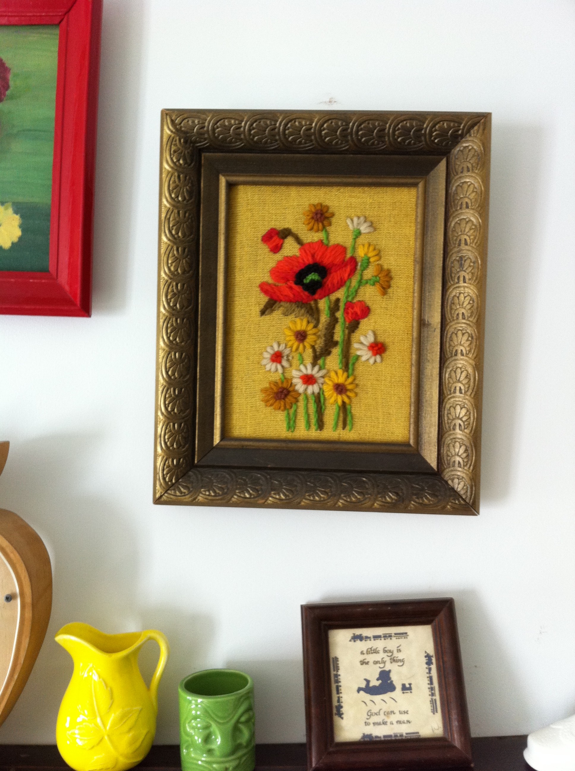
Recently, on a thrift store trolling session I was backslapped by these two lovely ladies:

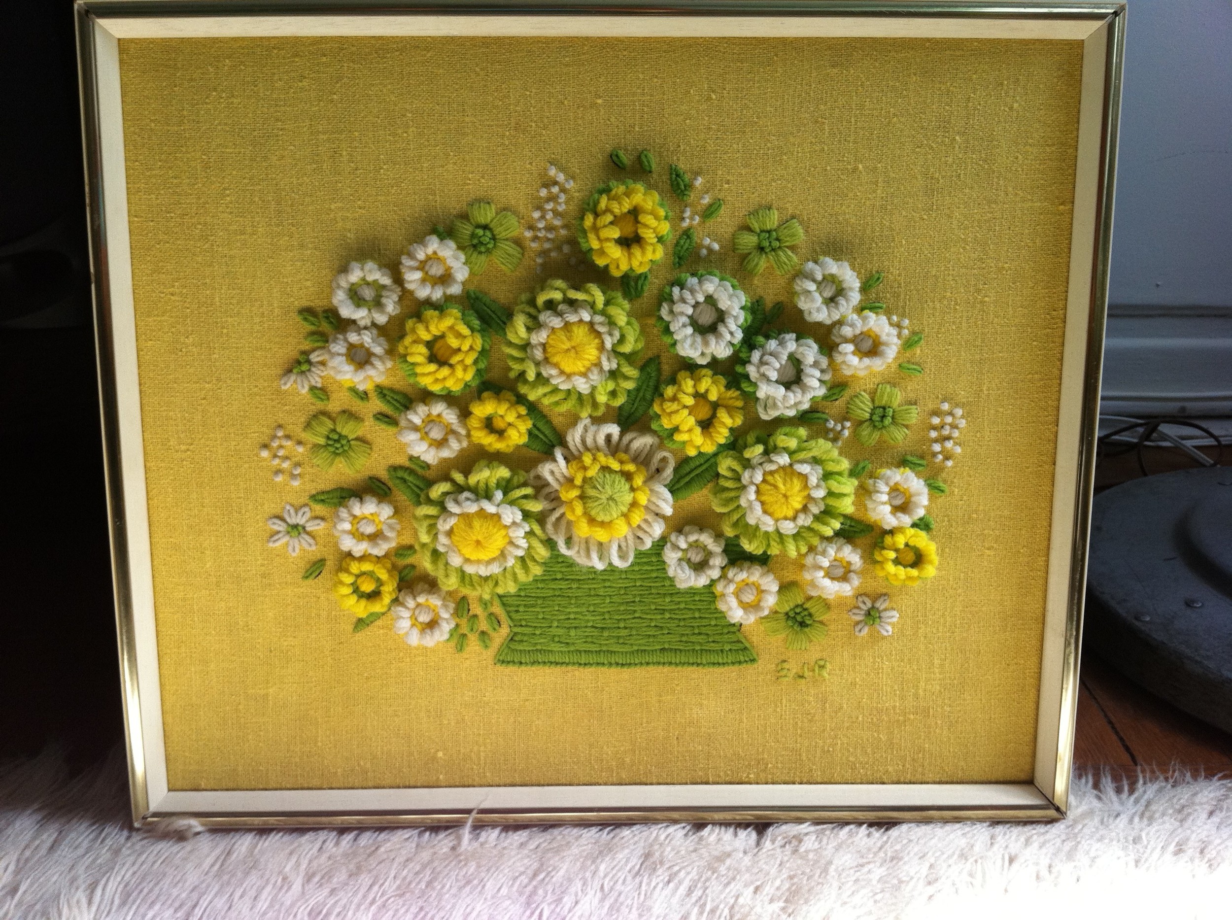
I don’t normally spend this much on yarn art, $55 & $45 respectively, but before I could even think twice about it, these gals jumped off the wall and landed in my shopping cart! (Don’t y’all just HATE that when that happens? WTF, Gals?!) But since this was a charity thrift store, this was a win-win for all of us!
And this goodness isn’t just limited to walls…check out these amazing pillows I’ve gathered: Delectable!
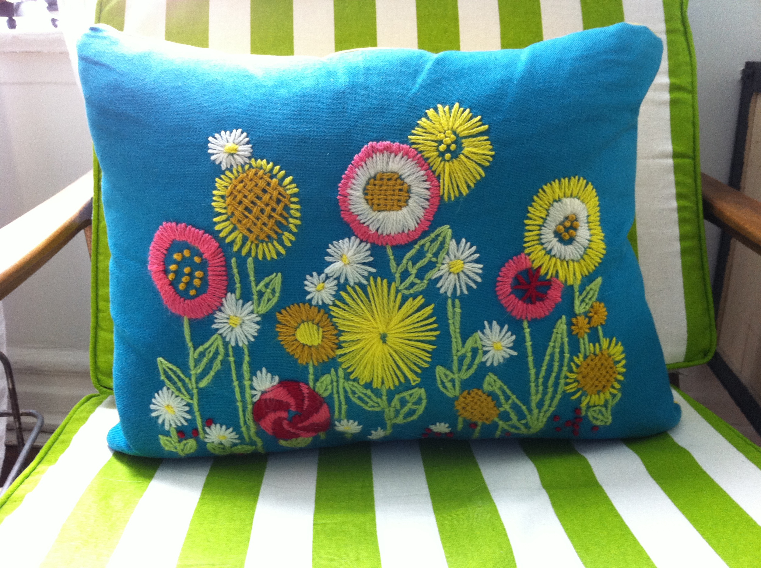


Now, y’all aren’t seeing things, some of this lusciousness I’m sharing is technically more embroidery, than yarn art, but it’s a thin enough line, or thread, in my opinion. And who the hell am I to suddenly get all tech-y on y’all? With that said, I’ve rounded up some treats of all thread-y types from the marketplace. Now go get your yarn on!
Mod Love Pillow by Jonathan Adler, $175
Pitcher of flowers by MerryMayFarm on Etsy, $12
1960s Rooster Picture Home Made by Stirlings on Etsy, $19.99
Sunny Day Needlepoint Vintage Picture on Linen by Bethanyg13 on Etsy, $15
Bargello Chevron Pillow by Jonathan Adler, $175
Keep Calm and Carry Yarn poster by JennieGee on Etsy, $20
Yarn Wreath Handmade Front Door- Orange and Cream, 12 in. by ItzFitz on Etsy, $40
Crewel Cat Pillow by August Morgan, $200
Dolly Parton Yarn Art by BrandyLynnAndPaul on Etsy, $200
A rug, some throw pillows and a gnome, oh MY! Y'all know what that means?Another shopping trip for Disa's house is about to take y'all there! (Video may take a bit longer to load, 'cause we're serving y'all hi-def!)
Be sure to check out the I Want That page for to-buy details on the items featured in the video. Holla!!!
 Just when y’all thought you were on the absolute threshold of being taken there by way of textiles, I’m gonna serve up some more! Behold, I give y’all the Salon!
Yet another Textile Turnout that has completely transformed the space & ultimately, MY LIFE…because, who are we, really, besides just human beings occupying space? I mean… PROFOUND, right? I KNOW!
So, the take away here for y’all is, I’m not only great at decorating, but I’m also really philosophical and deep. And most importantly, humble. Uh-huh.
Now, SHUT the f@#k you and the next time you get tired of your janky room or the furniture, think about empowering yourself with a Textile Turnout of your own. It’s fun, more affordable than buying all new furniture (so, now it’s Green too, triple value!!!) and it allows you the ability to completely create the kind of room that will take you there! And honestly, y’all, nothing…else…matters.
The time has come…for y’all to be TURNED OUT by way of Textiles!!!

It is with absolute decorating joy that I share these living room pics of my recent Textile Turnout. As a refresher, several weeks back, I went on an adventure to update the look of my living room & salon, by switching out all the textiles. Click past the break to see the rest of the amazing living room turnout results!
It goes without saying, but I’m totally thrilled! I love how fresh and bold my living room looks & feels! I’m also backslapped b/c even though my furniture is old, it has new energy and life with all these yummy fabrics!
Naturally, I’d like to thank the Academy and my agents, but most importantly, my upholsterer, Jose Abad. Without whom, y’all, I’d just be another pretty decorator. He’s really the unsung hero in all this. So let me give him his praise. I’ve worked with Jose on many projects for the past several years and he has never disappointed. He’s super-fast, amazingly skilled and incredibly priced. If y’all need any kind of upholstery, window treatments, pillows, etc. and you’re in the NYC area, you MUST call him! He can be reached through his website here. And by all means, tell him I sent you…
Be sure to check back soon for the salon turnout!
Don’t y’all just love waking up on a random Sunday morning with the spontaneous notion to paint a room-- Coffee? Bagel? 10” black & white horizontal stripes in the entryway? Easy! Actually, y’all, painting our entryway had been on my master punchlist for our Patrician Court apt. ever since moving in. I’d just been hemming and hawing about it, b/c it couldn’t just be a ‘typical’ paint job, no no. I wanted stripes! BIG BOLD horizontal stripes! Stripes aren’t really the devil’s work, y’all, they just require the right ingredients: a lot of perseverance, a laser level, painters tape and good paint. Oh, and a tireless husband who knows better than to say no!
Check out this Before and After Backslap:

Shut the ?!ck y’all! YES! I’m sooooo thrilled at how these turned out! Major drama, for minor money…in fact, these stripes are taking me there so much, I really don’t even need artwork-- another great reason for tricking out your walls with a bold paint treatment. Whether you want to get horizontal-- oh la la, y’all-- or vertical, the key to getting sexy stripes, is all in the technique.
So, here’s how we did it (don’t let the lengthy text scare y’all-- it’s easy, and a little length goes a long way, oh shiot!):
1. Once you’ve decided on your colors, you’ll need to paint the walls you want to treat with a coat of the base color (the background color that goes all the way up to the top and bottom of the wall). Mine was white.
2. Once that coat is dry, it’s time to tape out your stripes! A laser level is a HUGE help here! Decide on the width of your stripes and divide out the wall. Start at the top or bottom and set the laser level to your first line. With that in place, tape along the laser line. Keep in mind that the stripes you will paint will not have any tape covering them and the background color stripes will have the tape sitting inside their edges, so place the tape on top of or below your laser line accordingly (see the image below for help understanding when to tape above and below your laser line). Work your way up or down the wall one laser line at a time. This is really the most time consuming part, so be patient and accurate here y’all.
3. Whew, with that done it’s time for the secret step to ensure a crisp stripe line! In the sections that you want to paint your stripe color (ours was black), first paint a coat or two of your background color (again, ours was white). I know this sounds backwards, but it will ensure that anything that may bleed under your tape edge will be the same background color.
4. Let that backgound color coat dry and then it’s time for your stripe color at last! Paint your stripes with the stripe color and let it dry. Make sure you don’t have any patchy areas… this may require a second coat.
5. Finally once that’s all dry, it’s time to carefully peel off the painter’s tape (no tearing here, despite your unbridled passion) and get served by a striped wall! Oh, Luscious!
Sit back, relax and let those stripes serve you some drama!
What, y’all don’t have a salon in your house?! No, not where y'all get your cut, color & mani-pedi’s! No, No. This is the room- at least in our house- where lots of creative musings manifest: our wall of books, our desk, my prop closet. It’s also got the sweetest sitting area, for all that salon ‘conversation’ that goes on. Like our lengthy & informed discussions on Pillow Pet being a pillow AND our pet! Amazing!Yet despite all the dynamic creative activity in this one space, it too needs a Textile Turnout! Here’s what’s going down:
My Founding Fabric? This wonder from Waverly:
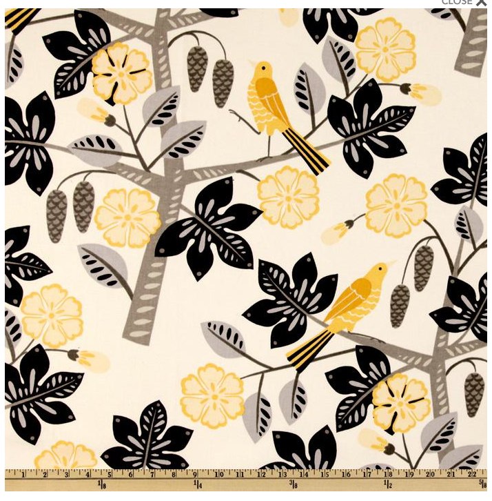 It’s a current pattern but has a real retro vibe. And even though it’s technically a floral, it’s so graphic. Dare I say it’s almost masculine? Oh, yes, I dare, y’all! And the colors are just backslapping me! Unlike the vintage Toile Founding Fabric for the living room, which I made into valances, I’ll be making this into throw pillows with solid black piping. I could’ve easily made window treatments out of this as well, but since the two rooms open onto one another, I thought I’d mix it up a bit. Plus, the pillows will be a great way to lead the eye around the room, to take in all the other textile-liciousness that I’m bringing in.
Like this wonderful trellis pattern (also by Waverly) that’s being made into curtains AND matching valances!
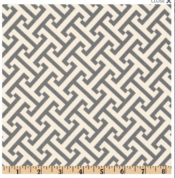
I’m trimming them in yellow, a color that I’m pulling right out of my Founding Fabric.

Can y’all just indulge me in a huge southern shout-out to Waverly! They just know how to SERVE IT, y’all! What I love most is that they have a massive assortment of fabrics in every possible style & material imaginable and in every color way imaginable. Even better, is that once you find a fabric you like, chances are they’ve done a coordinating fabric in a different pattern and/or material, but in the same color family. This basically translates into stress-less fabric selection, b/c a lot of the matching and coordinating are already done for you. For those folks who are terrified by choosing fabrics and mixing patterns, Waverly will fulfill your dreams & wallets! YES! All this & they’re super-affordable too!! Just don’t go too overboard— as much as I clearly love me some Waverly, you don’t want your room to look like their showroom! Everything in moderation… yes, even when decorating, dollbabies!!!
Speaking of moderation…this incredible zigzag will adorn the window screen room divider.
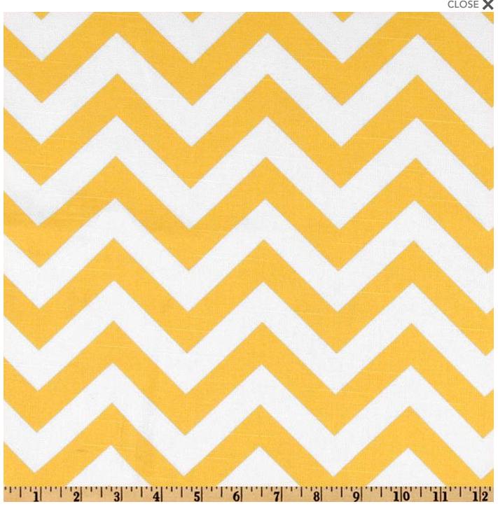 Yes, y’all, I have two rooms with old windows re-purposed as room dividers! Which, admittedly, is a bit excessive, but the original idea behind them was they’d one day live as one large room divider in the appropriately sized room. Since that’s yet to happen, I’ve got them serving drama in two rooms, which, is just double value, as far as I’m concerned. And it allows me the opportunity to have another item to adorn! Now, that’s what I call moderation…oh, shut the &!ck you!
And with that, my Textile Turnout is complete…and therefore my destiny, since the two are connected! But, don’t panic, I’ll be posting ‘before’ and ‘after’ shots, so y’all will get to see all this hot finished fabric action, firsthand.
Remember y'all, if you want sources for any of the yummy fabrics in this post, check the I want that! page for details.
 Y’all, I’d barely unpacked before I was already shopping for fabrics for our new apartment. Cause y’all know, if there’s ever a legit excuse necessary to give yourselves a home makeover, it’s a move into a new space. A lot of folks work themselves into a full-on panic thinking that buying all new furniture is the only real way to update the look of their homes. Not true. What they need is a Textile Turnout!! By switching out window treatments, throw pillow covers, upholstery and even rugs y’all can completely transform your spaces in the most dramatic & often EASIEST ways!
Once you’ve selected the items you want to turnout, now it’s time to shop! Y’all can go the route of pre-made/store bought, or custom made. Guess which method generally costs more? In either instance, to keep the shopping process from being overwhelming, I try to choose a “founding fabric” or foundation as my starting point. With a strong foundation, it’s easy to build up from there. Your foundation can be anything: a chic set of store-bought curtains, an amazing rug or an awesome throw pillow.
For me, a great print or pattern makes for a strong foundation b/c from it, I can get lots of yummy color cues for the other fabrics in the room. I grew up wearing Garanimals, so I say, “when in doubt, match it out”! If it seems elementary, it is, but you can never go wrong with this theory. Y’all can amp up the glam and sophistication by selecting shades or tones of colors. Also, this is where you can play with textures, other patterns and scale to add drama and depth.
Here’s what I mean…This amazing vintage toile is my founding fabric for valances in our living room: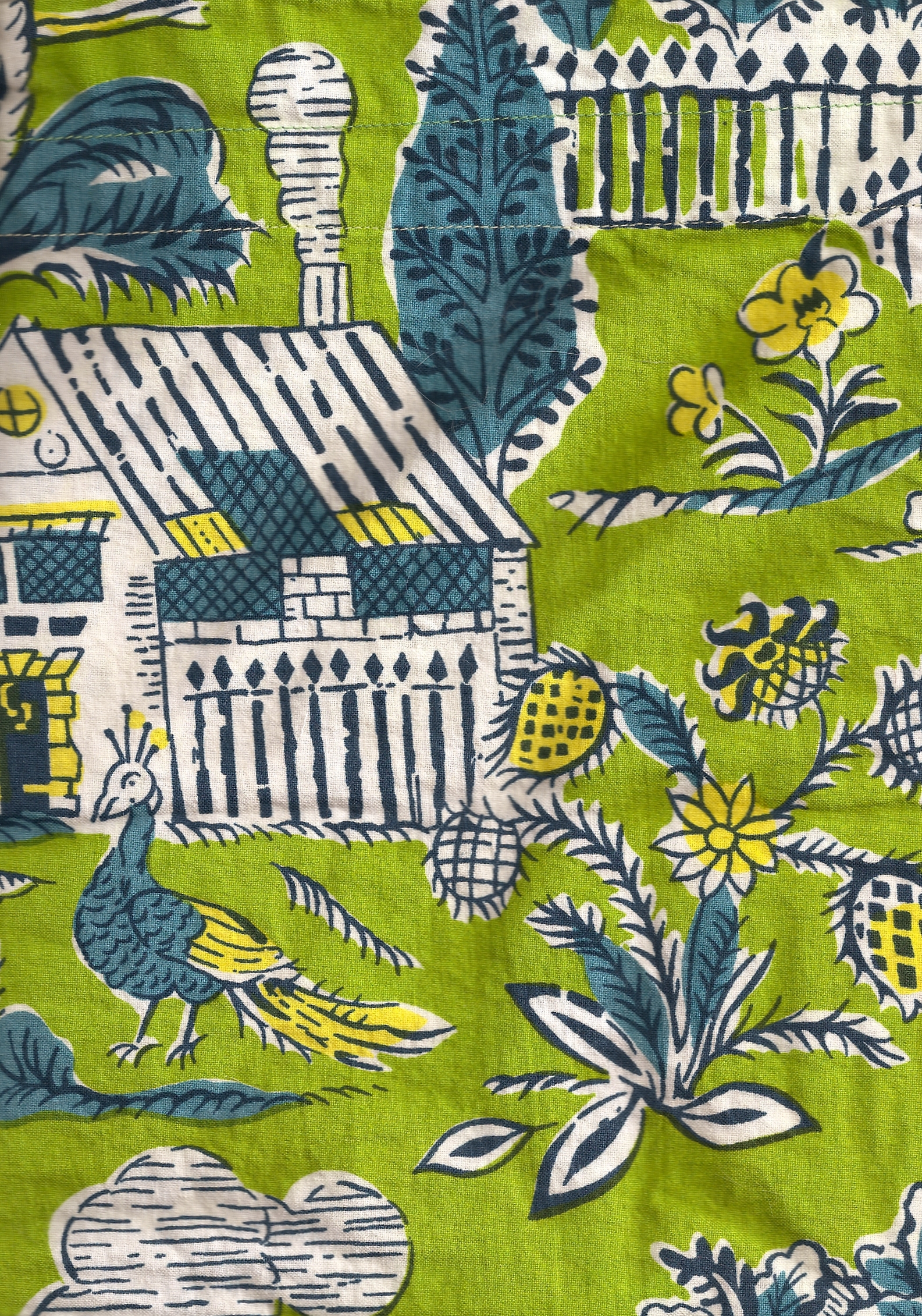 I scored this at Brooklyn Flea several weeks ago for $15 bucks…it’s in great condition and incidentally, is currently one large valance. But with some easy modifications, I’m going to make into two, since we have two windows in the living room. This medium scale print is busy as hell y’all & I love it!!! But paired with simple white panels trimmed in teal twill tape—a color I’m pulling right out of the print-- I’ll be taking y’all there with these window treatments.

But wait, there’s more! Check out this incredible awning stripe (from Premier Prints) I’ll be backslapping our living room chairs with! Oh shiot!  The bold graphic stripe will give order to the chaos that is the valances. And y’all don’t even need me to explain why I chose chartreuse…
I’m doing my window screen room divider in this Waverly number:
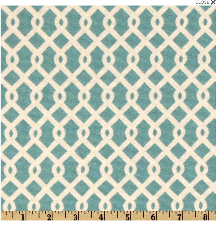
It’s yummy teal, graphic pattern will help to bring more order to the other side of the room. And b/c it’s smaller in scale, it works well with both the valance & chairs.
The sofa will get this canvas in teal: 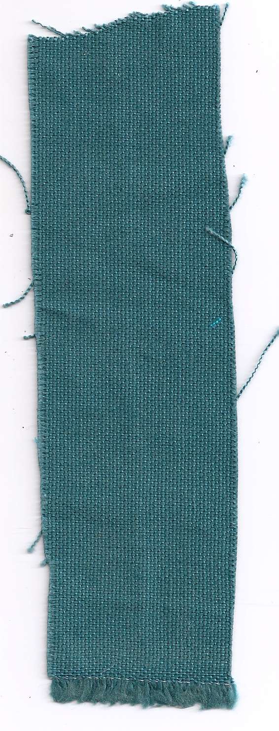
A solid is always a super-safe yet smart option, especially with a larger, upholstered piece. I’ll get more bang for my buck here b/c I can always turnout the look of this sofa by updating the throw pillows, when I want to freshen things up. This is why it’s a good idea to limit bolder patterns and prints—especially when it’s custom—to items that aren’t crazy expensive to redo.
Lastly, if any of y’all want some of the fabric goodness that I’ve featured, check out Fabric.com. And even if you hate what I’m doing to my space, y’all should STILL check out Fabric.com. Aside from their amazing selection of really yummy fabrics that are super-cheap, they carry all sorts of other fabric-related items as well as helpful hints on how to measure for yardage needed, etc. And remember: when fabric shopping anytime, ALWAYS get samples BEFORE you buy!!!
And be sure to check back y'all, as I'll be sure to post photos of our fully fabric-dazzled living room once it's finished!
Also if you want sources for any of the items in this post, check the I want that! page for details.
Merry Christmas y’all! As a gift to you dear readers, I bring you a new & improved feature on Blog-a-dazzle, where I’ll be listing all the ‘to-buy’ sources for the glam goodness used in decorating Disa’s house! Now, if y’all see something you want, you can buy it! (And send me an email if you don’t see it and want it! Holla!)
Disa’s Office:
Wallpaper- “Maharani” by Osborne & Little, available through interior designers www.osborneandlittle.com Approximate retail price is $156/roll.
Credenza- CB2 Halogen Lobster Credenza, $499 www.cb2.com (sadly, y'all, just discovered this only comes in white now! but, it's still just as chic!)
Desk- West Elm Parsons Desk With Drawers in polished white, $299 www.westelm.com
Desk Lamp- Home Goods Orange lamp, $29.99 www.homegoods.com (Home Goods doesn't have an e-commerce site...the bargains prevent inventory from staying around long enough to be put online, but find your local store on their website & check if they have this lamp)
... are being fulfilled y'all! Check out all the progress we've made here:
Y’all, there’s been a lot of glamour going on in my world recently, so please forgive my lapse in posts. The biggest is that we’ve moved into a new apartment, which y’all will be learning a lot more about right here... holla, new decorating hijinks!!! The other is the completion of our first episode in a new web-series I’ve developed called, Style Rehab. If the title doesn’t convey it enough, it’s a show about stylish ways to rehab, or rehabilitate, one’s space. Our first episode features Andrea, who’s in dire need of some craft corner style love. Watch and enjoy and of course, I welcome your comments! And if any of y’all are in need of a serious intervention, Style Rehab is taking on new patients! Send me an email of your ailments, we’ll get you good and fixed-up!
Y’all, choosing the right window treatments for your space can be overwhelming, to say the least. There are tons of options. I like to let the existing architecture of the window trim help guide my choice for a solution. If it’s serving me drama, I go with a treatment that won’t compete with that, but will still have some razzamatazz for the room. That’s usually simple muslin, or canvas curtain panels that puddle a little on the floor. I add a little somethin’-somethin’ with grommets, bead chain, and re-purposed pipe and flange as the curtain rods. But not always:
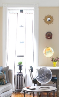
These are my living room curtains, which I made from muslin and then trimmed in twill tape! They’re hung from inexpensive heavy duty tension rods which are excellent when you’re renting and don’t want to make tons of holes in your window frames. I love how I’ve got functional curtains to filter light, but I still get to see the delicious trim of the windows. Yummy, y’all!
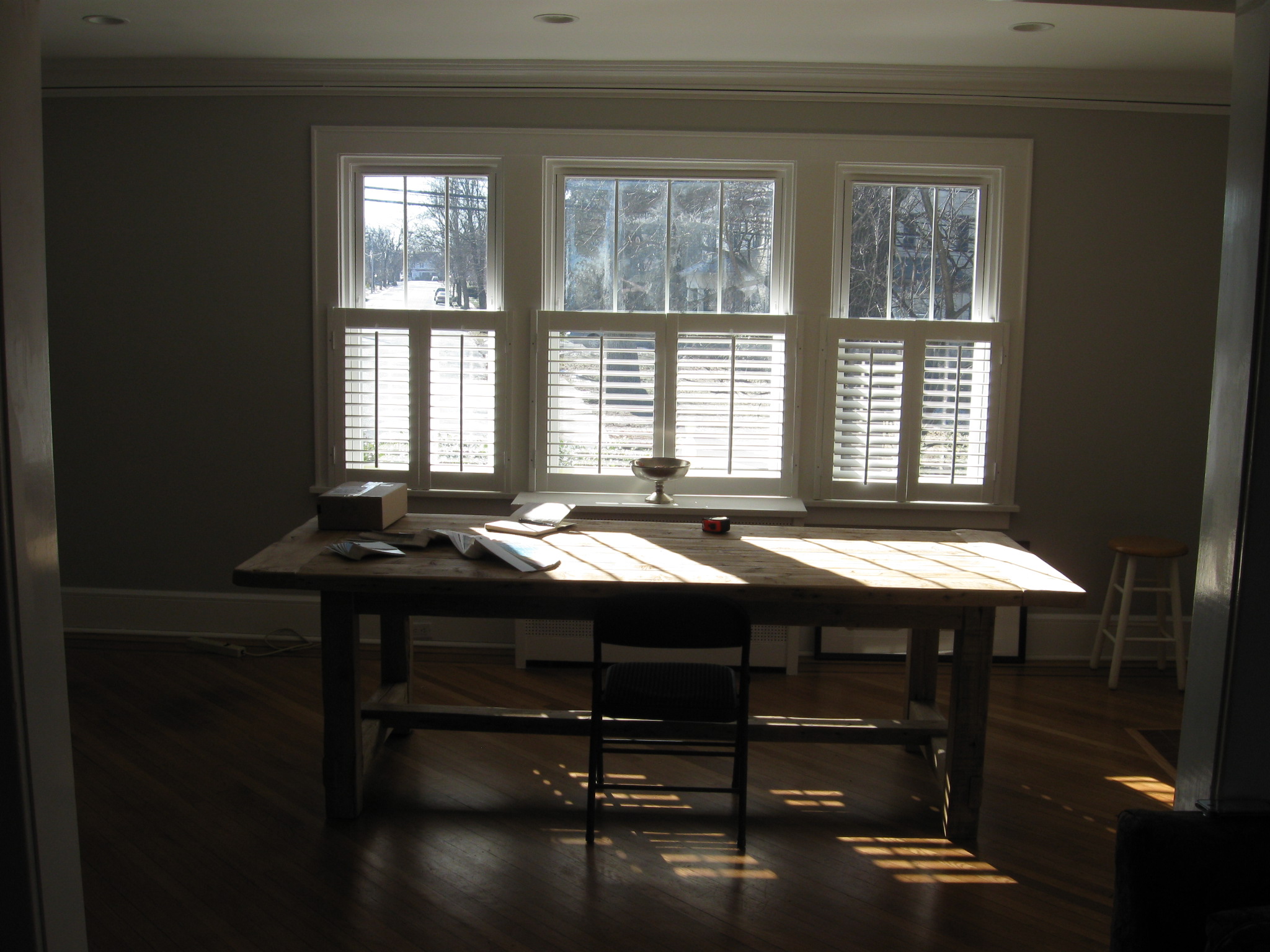 It’s a similar situation in Disa’s dining room. She’s got a giant window space (it’s actually three separate windows) surrounded by pretty wood trim. She’s had these white plantation shutters already installed on the bottom half, (LOVE!) but needs a solution for the top half.
Like most folks, she wants privacy, but also still wants some natural light. There are quite a few solutions for this scenario, but we’re going with a relaxed roman shade. I love roman shades, especially the relaxed style. See an example here y'all. They’re functional, straightforward, and unfussy. They also help add softness and are a great way to inject color and pattern into a space. Plus, if mounted inside the window frame, they perform while still sharing the spotlight with architectural details like our wood trim.
Y’all can purchase ready-made roman shades (at Target.com, JC Penney, Overstock.com) but I strongly recommend going custom. Remember y’all: Custom-ness is next to Godliness! Sure, it’s pricier, but worth the investment b/c your windows are the eyes to your spaces’ soul. For those of you fortunate enough to live near Calico Corners, like Disa, take yourself there immediately! Don’t fret if you don’t-- They have a full-service website, just waiting to take y’all there! These peeps do all things fabric: upholstery projects, window treatments, gorgeous fabrics by the yard. They’re knowledgeable, friendly- holla to Lynn- and sure know how to serve some hot music hits for increased shopping excitement! In fact, watch my complete conniption with Disa in Calico Corners for yourselves:
Oh, y’all that did feel good! Even better, we got a major feature of Disa’s dining room taken care of and I got my dance on! Decorating is FUN again!
Photo Credit for Living Room Drapes image: Hector Sanchez
Y’all know sometimes you just can’t control exactly when or where you’ll want to bust a move…like at your local Home Depot, where on another makeover visit with Disa in Maplewood NJ, she tore up the plumbing aisle with some dancing glory! Check it:
I have no idea why I’m whispering in that bit, but it sure does add some drama!
And y’all aren’t going to believe the amazing industrial glassfront cabinet we scored at this wonderful architectural/found object shop called, 2 Guys From Newstead! This place wasn’t even open when we first pulled up, but after witnessing my total freakfest through the windows, complete with shrieks and lots of arm flailing, they opened right up! That’s what I call effective window shopping, y’all!! That cabinet is going to be amazing for china storage in Disa’s dining room! I love to mix in unexpected, re-purposed pieces like this into spaces. Y’all don’t have to limit yourselves when choosing furniture. Think about how you need the piece to function for you in your space, and then think of all the other options that are out there to serve that function in terms of furniture. Look at magazines and tear out pages for inspiration.
For Disa, I needed a china storage solution but I also wanted an industrial/metal element in the space. Instead of just jumping right onto the typical china hutch train, I thought about different storage pieces that could be re-purposed to hold china…and look hot in the process. Thus, a metal bookcase with glass- a feature that still speaks to actual china hutch origins- came to mind. The next obvious part of all this, as y’all have no doubt figured out, is finding these pieces. But that’s the best part, where all the shenanigans can be had- like getting your groove on in a Home Depot! Y'all can have tons of fun (and often SAVE big) by scouring unexpected places if you keep an open mind: junk shops like the one above, craigslist, ebay, thrift stores, flea markets and yard sales. Added bonus: when buying vintage or gently used furniture you're adding a layer of authenticity to your space that could be lacking if everything is store bought and brand new. Also, re-purposing gives you the flexibility to customize a piece to perfectly suit your needs. And custom-ness is next to Godliness, y'all! D.I.Y. yourselves!
So, Disa and I tore up some aisles on our first, but certainly not last, shopping excursion in the quest of fulfilling her dreams by way of her house re-design. And be sure to re-watch the video above...yes, I do look that good on camera as well as off, y'all, yet I'm also sharing a clever curtain rod treatment that will send you dancing to your nearest plumbing-parts store! uh-huh, I've just written rod and plumbing in the same sentence! Design Scandal! Now go get to shopping!
Y’all, it's been a while, but I'm back! If you hadn’t guessed it already, designing a House of Destiny is no easy task—especially when you’re working with someone as glam as Disa. Afterall, this is the lady who’s been known to rock a gold lamé headband AND take color inspiration for her house from an 80’s prom dress! Damn! But don’t be fooled, y’all, my years spent in shoulder pads and ‘Cruel Summer’ pastel bandannas helped make me the style friend I am today! Thus, with feathered hair, I give you my sketches for Disa’s Dining Room:
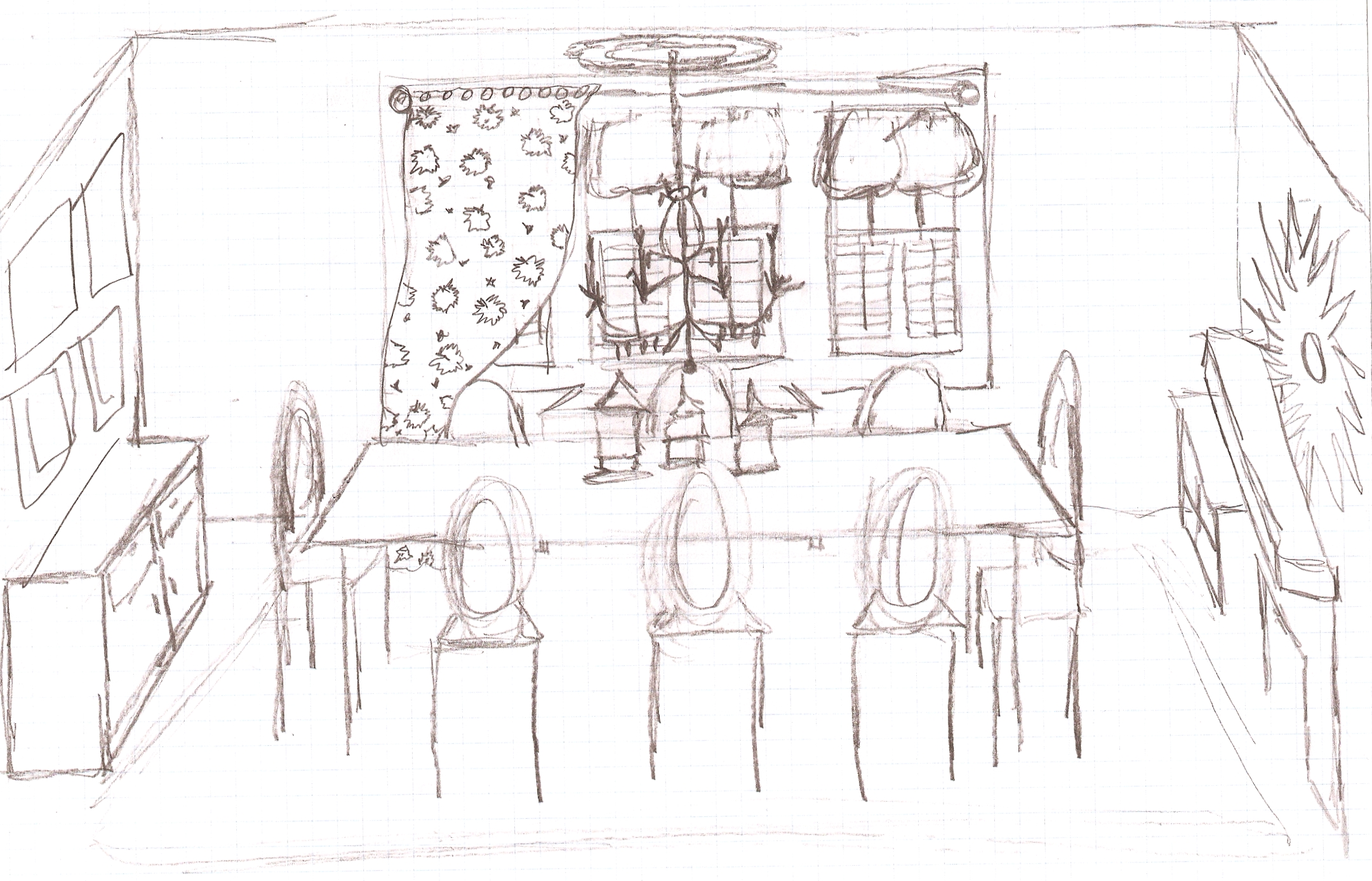 Aside from wanting a kick-ass place to entertain, her specific wishlist for the room was this:
The overall vibe I’m going for is feminine- rustic meets industrial. Disa established the rustic because she’d already bought the dining table and chairs. To contrast all the yummy wood going on, I’m going to weave in hits of feminine glitz- a crystal chandelier, mercury glass candlesticks, luxurious fabric used to create a window treatment , a gorgeous rug ! I’ll bring in the industrial with metal pieces such as a china cabinet, window treatment hardware, and galvanized accent architectural pieces. We’ll lose the dark wood buffet. Here’s what I’m proposing:
There’s also an awkward nook beside the fireplace, so I suggested a built-in cabinet that could double as a bar…now, that nook becomes an attractive solution and a real feature in the space, here’s the sketch showing that:
On the wall leading into the living room, I’ve proposed a gallery style treatment for family photos and artwork, complete with cute lighting and a sweet bench that can double as additional seating for one of Disa’s rage-a-thons!:
As with most design projects, there will be adjustments, fits of rage, Dynasty-like slaps, tears…maybe even some bloodshed…but that’s what makes it FUN, folks! This is home decorating, y’all! So, I’m off to start turning it out…In the meantime, enjoy some highlights from my last visit with Disa where I shared these sketches with her:
Y’all, inspiration for redoing your space can come from anywhere…like an incredible Lisa Lisa & Cult Jam song, or even a bad-ass bridesmaid dress! Meet glam girl Debbie, or as I call her, Disarrono, or even more elegantly, just Disa (as her purple bridesmaid dress with matching headband would suggest- pure ‘Dynasty’ drama! I love it!) Disa and her adorable family (husband of hotness Brian and love bug son Will) need some help with their new home in the quaint town of Maplewood, NJ. Holla, new project for PJ!
I’m doing four rooms: dining room, den, office and entryway. It’s a bit of an undertaking, but it’s really exciting b/c their home is so charming. I love them and want to help them fulfill their house destiny!!! Also, y’all, these are the architectural details of dreams…moldings, hardwood floors, glass insert doors, a yard…just an overall fabulosity that’s only a 35-minute train ride from NYC. Check out these before shots:
It should come as no shock after watching our hot music video above that Disa wants to work in a purple and silver color palatte for the dining room. The other rooms will get some fun complimentary colors that I’ll present to her.  She picked out Benjamin Moore’s Raspberry Ice #2072-70 on the fan deck as the starting color, which as y’all can see here ends with Dark Basalt #2072-10. I think it’s a pretty & sophisticated group of purple to work within…we get some hits of the color in the bridesmaid dress that fulfills her dreams, but the range of purples also opens up more possibilities to work in multiple shades.
I think having more shades of one color in a room gives a room layers and depth…it’s also great b/c you have more options when shopping for objects that go into the room. Plus, I know a lot of y’all freak out when it comes to color and how to decorate with it. Avoid color trauma and a lot of costly purchase mistakes by just shopping with your paint chips. Most paint companies print their paint colors in color ranges on one chip, like the one pictured here. And if they don’t print multiple color ranges on one chip, they usually group them by color range when displayed…take your color choice and then two or three before and after your color choice. Now you’ve just taken yourself there with a color range! Holla! Y’all can also check out www.benjaminmoore.com for terrific tips and tricks when it comes to not only painting, but other overall color goodness as well.
So, let the House of Disa’s Dynasty begin! Expect to be updated regularly with lots of fun pics, video and drama details of the journey to transforming this amazing space.
Oh and lest you think I didn’t really love y'all, my dear readers, here’s a bonus video of Debbie before she was Disa… enjoy!
WOW... I have a crush on HER! Take us there Disa!