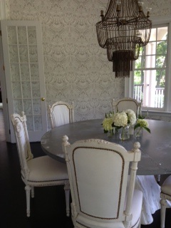
Y'all, TRUST that this GORG dining room didn't just wake up like this...
Read MoreGuess Who's Coming to Dinner?
Awesome Spaces
Y'all, TRUST that this GORG dining room didn't just wake up like this...
Read MoreY'all, here's a HOT tip...repetition makes for one stylish space, if done in the right way. No, this isn't some ancient technique passed down by the decorators of yesteryear...it's really current and makes a huge impact in a space...what is it? This:
By taking a pattern, whether it be a wallpaper or fabric and repeating it on multiple surfaces in one space, you get repetition (this also applies to well-edited collections/collectibles, btw). Sometimes you also get a massive migraine too but there's pills for that...ingest, y'all! This treatment can be a chic way to really amp up the glamour and drama in a space, particularly one that's smaller or has peculiar architecture, like an dormer room. I know it seems counterproductive to completely envelope a tee-niny room in a cra cra pattern, but when executed well, the endless repetition, tends to erase the physical structure & boundaries of the room, so you're left with a seemingly vast expanse of space. Are y'all keeping up?
I use repetition a lot in my work, but have never gone full-on immersion like the above genius example...until now. Our bathroom is a cute spot and will make the perfect place to have a pattern blow out! YES! Here's what it looks like:
 I have this amazing shower curtain that I scored from Urban Outfitters, that sadly enough, is no longer available on their website:
 So since I can't buy more shower curtains to use as fabric for the wall treatment (which depending upon the specific application, isn't a practical thing in a bathroom anyway)...I'll be painting this pattern, by hand! Uh huh, I'm an absolute d.i.y. dork that way and I enjoy self-torture! But, since it's so organic and hand drawn-looking as it is-- I feel confident that I can re-create it, even if it's not perfect. I'm also going to play with scale of the pattern, just to give it more dimension when it's on the walls...and since I have existing tile work partly covering every wall, I don't have to paint as much...holla! If y'all were to tackle a similar project, remember you don't have to go to such extreme lengths by hand painting a pattern b/c there's a ton of fabrics that are also available as wallpapers or some fabrics can be used with spray starch and made into wallpapers as well...check out my former co-worker and friend, Kristin Appenbrink's post about it on Real Simple's Simply Stated blog, here. And check back soon for progress posts on this project! You're forewarned-- It may take a minute, y'all!
 Y'all, it's been a wonderful journey and I'm thrilled to share the results of Disa's House Of Destiny...special shout out to Hector Sanchez, who's an amazing photographer and a great friend...and thanks to Disa and family for putting up with all of the cra cra!
Enjoy:
And of course, for the REAL Disa diehards...check out this special bonus 'behind the photo shoot' video to learn some indispensible table-setting tips!
Y'all it's been bed bath and BEYOND forever since our last Disa episode-- so sorry!!! A cliffhanger was never intended for the season, but sometimes a telenovela like ours can get turned around-- y'all know how it is...decorating is DRAMA! What follows is a culmination of the past several visits (& projects) to Disa's Maplewood manse on our road to completion served up in one scrumptious video feast...savor it y'all! Massive holla shout out to Dylan, btw, who made this masterpiece possible...love you! Cue fog machine:
Y'all there are tons of things to do when family comes to visit in NYC, but one of the best, by far, is Dylan's Candy Bar!!!
There's all kinds of sweet treats to enjoy but even more decorating 'lisciousness to be had...look at all this yummy:
Talk about color and pattern inspiration?!? Or what about making your own custom candy light box, like those stairs-- genius! Or imagine a wallpaper accent wall done in THAT pattern?! And yes, this is a gumball tabletop-- incredible!
True that, y'all! Enjoy!!!
Y'all, it's time to get some full-on eye candy! The office is complete, woohoo, BUT before any hot reveal action can occur, have to let y'all know about a slight curve ball with the design plan/furniture solution. I'd found those awesome Ikea desk/combo units (see previous post for pic) which my client was totally on board with. But then she wasn't liking the fact that when configured in the space, they would partially block the inspiration boards that would be retrofitted over the existing soundproof windows. And baby just can't have ANY kind of blockage...ok? Y'all know that's right...flush IT! So, with some slight design adjustments, each worker will now get to rock these as their desks...
I love this new solution! The butcher block desk tops will give us warmth...the bases will serve us lots of yummy storage (hide those computer towers whenever y'all can, biotches!)...mix them all together and you've got yourselves some kind of sassy-chic-home-away-from-home PR/communications office realness!
And just so y'all know how hands-on I am with all my projects...take a look at this mini mountain that I was pushing around Ikea:

But trust that mountain was conquered and an office was born, y'all:
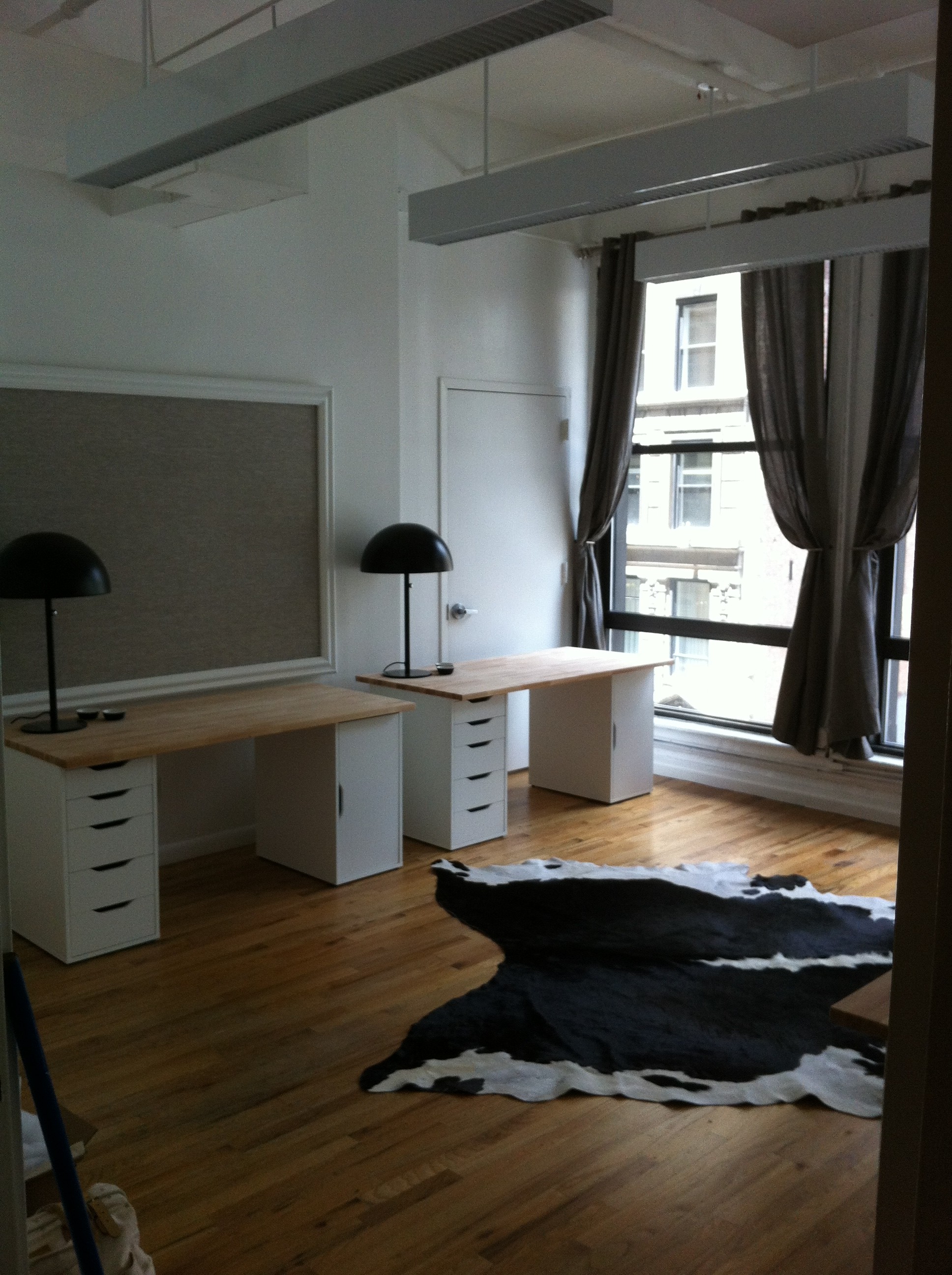
Obvi, chairs will move in along with computers and the other inevitable office trappings, but this baby is ready to rock and roll! I'm really pleased with how it turned out and more importantly, my client (& her staff) have had their new office dreams AND destinies fulfilled! What more could I ask for in life, y'all?
My client threw me a conundrum, or tried to anyway, when she tells me that she needs me to decorate her new office. For a staff of four. In one room. Short sentences with periods equal drama.
The pics are in the previous post...here's my plan of attack:
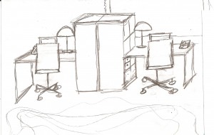
If y'all can't tell what in hell is going on with my sketch, here's the actual product sheet:

I love these cool Ikea desk/bookcase combo units! The lamps are just tres chic, no matter what day of the week it is. Cute cork and metal desk organizers. Clients' existing office chairs are gorg, so they're being re-used, which we love, not only for the environment, but also for the budget. And can we all just writhe around all over that cowhide rug? Go ahead, y'all writhe!!! YES! Clearly, I'm going for a very black and white/neutral color palette. Client is in PR/Communications...she's way hip and way savvy. I wanted to keep her workspace light and airy and unfussy. Let the color come in with her custom inspiration boards...oh, wait...I didn't mention those yet?
So, y'all saw the pics of the atrocious interior soundproof windows...I'm proposing we retrofit them as giant inspiration/bulletin boards! Made from what? C'mon y'all...HOMOSOTE!!! Call back! That's right, we're gonna just cut some homosote to size and take those odd windows and make them work for us! I'll upholster these with a nice neutral linen and frame them out with some chunky molding/trim...and since there are two windows in the space, this new office will score double bulletin board value so client can pin her PR & communications for days on end!
We'll just re-use the existing window treatments and give that space a fresh coat of white paint...and voila-- new office! Stay tuned for more process shots as it all comes together!
One of my interior clients needed a new office-- fast and cheap (like my lovers)! As most of y'all know, that's a challenge I'm always up for...sassy scandals! Oh and this room has to comfortably accomodate four peeps...here's the new spot: Uh-huh I've always taken issue with interior windows in spaces, but actually, y'all, this is a former recording studio, so those are actually pretty standard fare. It's soundproofed and hung on a weird angle, that you can't really see in the pics, but I've got a plan for that mess...here's more BEFORE office eye candy:


 Stay tuned to see my design solution(s) on how I'm going to make this space really sing!!!
Nov 9th was my last post? Oh shiot, I guess I’m overdue for a giant Alexis Colby Style Slap right about now…but hold that hand, y’all! For the past couple months I’ve started my own LLC, Alchemy Eclectic, gotten three new interior dec projects and have still been prop styling! In fact, as I type this, I’m in the middle of a two week gig in San Francisco for Pottery Barn Bed & Bath – so, shut the FU*@ YOU! Love y’all, Grandbaby Blog A Dazzlers!!! I’m excited to finally be able to share pics from a Brooklyn bedroom I designed almost two years ago…shot by the wonderfully talented Bob Martus.
 The room(s) already had this delicious architectural detail, but to make it a real feast, a two-toned paint treatment was added. Yummy!
Like most spaces in NYC, closets are virtually non-existent, so a potentially awkward nook was commandeered as a dressing room.
My client is a real dude, not necessarily a clothes-horse per se, but ANYONE can appreciate a room-turned-closet that’s tricked out with lots of stylish yet functional storage and a statement mirror! Your closets don’t have to be ugly, folks!
Overall, I think this space rocks! It’s just the right mix of modern and vintage...masculine and feminine…
I love that a questionable nook was turned out and became a swank dressing "den"! Hello Don Draper! I also j'adore the celebration of phenomenal architecture with that modern graphic paint treatment! So, hopefully I've given y'all a little somethin' somethin' to make up for my absence...rest assured, there's much more Dazzle goodness yet to come!

It was a mere four days ago that our kitchen cabinets were serving some heapin' helpins of 'oak' horrendousness, only to be transformed with a super-easy paint job! Our kitchen is lighter, brighter and feels brand new! And shut the &$ck y'all, this makeover only cost me $60 in supplies! Now, this is what I call yummy, y'all!
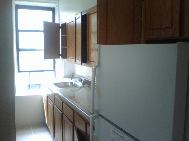 Y’all, one of the biggest projects off my apartment ‘Master List’ is painting our kitchen cabinets. Some poor soul, somewhere, thought golden oak cabinetry was just BEYOND glamorous. And then they went and punctuated it with bronzey-brass hinges! I just knew I was going to be greeted by a big ole shoulder pad when opening one of the cabinets for the first time! But instead of being served ‘Dynasty’, all I got was dead roaches and mouse droppings. And y’all know, that’s not the kind of drama I want coming out of my kitchen, oh no, shut the fu$% YOU! So, my first week in our place was spent scouring every inch of that kitchen beyond belief…yummy!
Fast forward to now: there’s been LOTS of drama in that kitchen and thankfully none that involve crawly-critters. I’ve begun to tackle the painting and it’s been going so well—I couldn’t be more pleased!

As y'all can see, I decided to go for a clean, simple and modern update by choosing white. There's also white in the "granite" countertop, so I knew I couldn't go wrong. I'm already backslapped by how great it looks and I'm not even halfway finished! The entire kitchen looks brighter and the cabinets look brand new. And y'all aren't even going to believe this, but I'm not even bothered by the brass hinges now b/c when paired with crisp white, their brass patina is chic! I said BRASS-SLAPPED! This is gettin' good, y'all...BUT WAIT, there's more! Be sure to check back-- I'll be sharing my progress as well as my step by step painting tips and tricks...tender decorating at it's finest!
 Just when y’all thought you were on the absolute threshold of being taken there by way of textiles, I’m gonna serve up some more! Behold, I give y’all the Salon!
Yet another Textile Turnout that has completely transformed the space & ultimately, MY LIFE…because, who are we, really, besides just human beings occupying space? I mean… PROFOUND, right? I KNOW!
So, the take away here for y’all is, I’m not only great at decorating, but I’m also really philosophical and deep. And most importantly, humble. Uh-huh.
Now, SHUT the f@#k you and the next time you get tired of your janky room or the furniture, think about empowering yourself with a Textile Turnout of your own. It’s fun, more affordable than buying all new furniture (so, now it’s Green too, triple value!!!) and it allows you the ability to completely create the kind of room that will take you there! And honestly, y’all, nothing…else…matters.
The time has come…for y’all to be TURNED OUT by way of Textiles!!!

It is with absolute decorating joy that I share these living room pics of my recent Textile Turnout. As a refresher, several weeks back, I went on an adventure to update the look of my living room & salon, by switching out all the textiles. Click past the break to see the rest of the amazing living room turnout results!
It goes without saying, but I’m totally thrilled! I love how fresh and bold my living room looks & feels! I’m also backslapped b/c even though my furniture is old, it has new energy and life with all these yummy fabrics!
Naturally, I’d like to thank the Academy and my agents, but most importantly, my upholsterer, Jose Abad. Without whom, y’all, I’d just be another pretty decorator. He’s really the unsung hero in all this. So let me give him his praise. I’ve worked with Jose on many projects for the past several years and he has never disappointed. He’s super-fast, amazingly skilled and incredibly priced. If y’all need any kind of upholstery, window treatments, pillows, etc. and you’re in the NYC area, you MUST call him! He can be reached through his website here. And by all means, tell him I sent you…
Be sure to check back soon for the salon turnout!
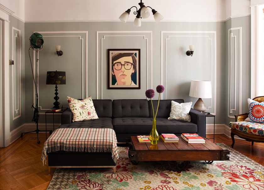 Y'all, design*sponge has struck again and taken us there! So this past summer, I got to work with the very talented Photographer (and friend) David Land. He has two adorable friends, Mike and Emma, who have an even more adorable brownstone in Brooklyn. It’s cuteness personified y’all! I jumped at the chance when he asked me to style the place for a photo shoot of their home. And now y’all can see this photo and style goodness featured here on design*sponge! Mmmm spongy!
... are being fulfilled y'all! Check out all the progress we've made here:
 One of the best dumpster dives I ever had was when I still lived on Status Island, NY (a.k.a. Staten Island)…yes, y’all, I called the oft-forgot borough home for three years! And what a sweet home it was… top floor a an old grain warehouse, at least 3500 sq feet of space... and my bedroom, which doubled as my rehearsal space was complete with ballet bars and a wall of mirrors! Strictly for rehearsals, ahem, of course! Oh shiot! Me and my creative partner, Alane, dubbed the place Chateau Monroe. She's still rockin' it there, click here for a peek at the fabulous pics she's taken of the Chateau!

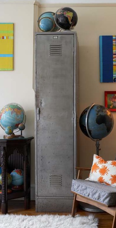
Chateau is directly across the street from an elementary school, which provided more street side bounty than y'all can shake a stick at! One dive unearthed the locker pictured here. In perfect condition, aside from the random sticker & used stick of deodorant, this was a major score! Lockers (or any metal cabinets for that matter) always get me at “hello” for their industrial hotness and versatility as storage workhorses. The repurposing possibilities are endless! So, hello to my new DVD cabinet! This find was also extraordinary b/c almost a year earlier, Alane and I had found an identical locker at the same school! Now I had double locker love, y’all! Who doesn’t adore a twin?!
After a thorough scrub out I stripped the green paint using paint remover. Now, this is labor intensive beyond belief, y’all, but I love the look of unfinished steel and I’d already done the same treatment to the matching locker. Follow the included instructions on your paint remover can. You can also make the process as fast as possible with some power tool help. I used an electric sander and a sander drill attachment. Note: when using any kind of sand paper, you’ll get scratch marks in the steel or whatever metal you’re uncovering. But, to keep the marks at a minimum, remember that the finer the grade of sandpaper, the smaller the marks. Also, stripping the paint in the same direction and with the same amount of pressure to the power tool will keep the marks consistent and much less noticeable. If y’all are totally OCD and just can’t stand marks, then there’s always scraping the whole piece with a hand scraper. But y’all will definitely need to have some alcohol on hand for that process! Stripping paint is no joke, so to save the remainder of my sanity, I just kept the institutional green finish on the inside of the locker. No one cares what's going on inside when the outside looks so damn good, as witnessed in the glam opening shot!
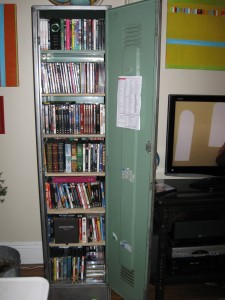
Once stripped, I sealed the locker with Butcher’s Bowling Alley Wax. This amazing product seals the piece to prevent oxidization, or rust. It also leaves a really nice matte finish. If you don’t want to use wax, you can also use a polyurethane, but y’all can’t skip this step or you’ll RUSTgret it! Get it?! Oh genius!
Finally, I measured and prepped the locker for wood shelving, (which I had cut at Lowe’s). This involved drilling what seemed to be about 500 holes into both sides of the locker. These holes would accommodate the L brackets that would support my wood shelves. Make sure y’all measure twice on this part, b/c once you’ve drilled into metal, you can’t really patch it! Five shelves later, I’ve got industrial storage chic-ness that houses a massive movie collection, with growing room too!
Y'all, won't you fulfill my destiny by sharing some of your repurposed furniture goodness with me? Send an email to blog@pjmehaffey.com and I'll share in a future post. Take us there!